You're viewing free preview questions — 4 questions previewing here — subscribe to unlock 64 more, plus the Full Question Bank, Mock Papers & Worksheets.Upgrade
Bar Charts Line Graphs Pie Charts — Free MYP2 Mathematics Practice Questions

1QuestionConstructing Pie Charts with a ProtractorConcept Practice
2 marks~3 minCriterion A
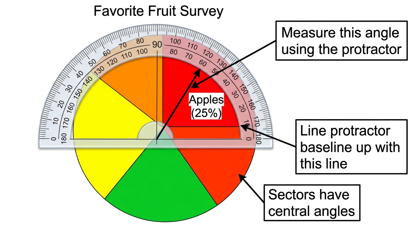
A survey asked 100 students to name their favourite fruit. The results are shown in a pie chart. The sector for apples represents 25% of the students.
a
State the total number of degrees in a full circle. [1]
b
Calculate the angle of the sector for apples. Show your working. [1]

Solutions
2QuestionPlotting and Analyzing Line GraphsAssessment Practice
6 marks~9 minCriterion B
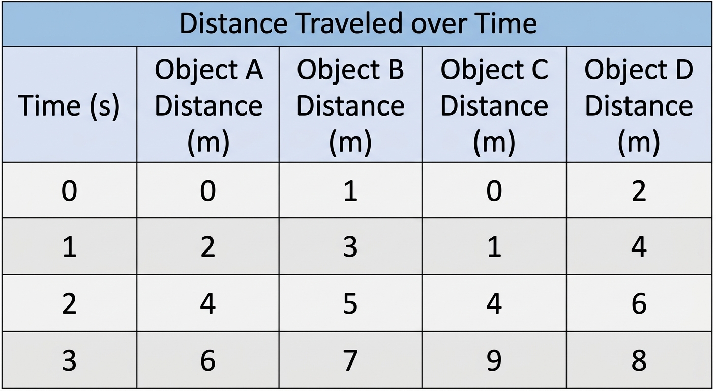
The table below shows the distance (km) travelled by four objects over time (hours).
Plot all four objects on one line graph with time on the -axis and distance on the -axis.
| Object A | (0 | 0) | (1 | 2) | (2 | 4) | (3 | 6) |
|---|---|---|---|---|---|---|---|---|
| Object B | (0 | 1) | (1 | 3) | (2 | 5) | (3 | 7) |
| Object C | (0 | 0) | (1 | 1) | (2 | 4) | (3 | 9) |
| Object D | (0 | 2) | (1 | 4) | (2 | 6) | (3 | 8) |
Plot all four objects on one line graph with time on the -axis and distance on the -axis.
a
Calculate the slope of each object's line. [2]
b
Each object follows a rule of the form , where is a number called the coefficient. Explain how the coefficient relates to the slope you found in part (a). [2]
c
Object E follows the rule . Compare Object E's line with Object A's line, referring to both slope and starting point. [2]
Solutions
3QuestionChoosing the Right Graph for the DataAssessment Practice
6 marks~9 minCriterion C
A school cafeteria records lunch sales for one day:
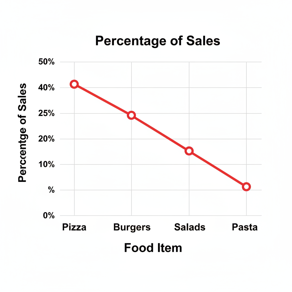
Pizza: 40% | Burgers: 25% | Salads: 20% | Pasta: 15%
A student displays this data as a line graph, with food items on the x-axis and percentage of sales on the y-axis. The student claims the graph shows sales are "trending downward."
Pizza: 40% | Burgers: 25% | Salads: 20% | Pasta: 15%
A student displays this data as a line graph, with food items on the x-axis and percentage of sales on the y-axis. The student claims the graph shows sales are "trending downward."
a
State whether the data is categorical or numerical. [1]
b
Identify a more suitable graph type and explain why it is better suited to this data than a line graph. [3]
c
Explain why the student's claim about a "downward trend" is misleading. [2]
Solutions
4QuestionConstructing Pie Charts with a ProtractorAssessment Practice
8 marks~12 minCriterion D
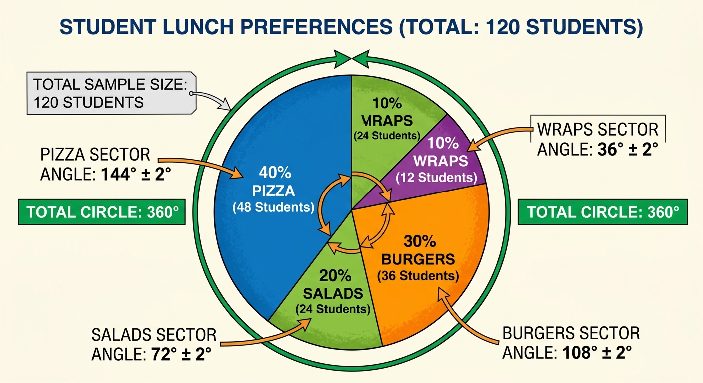
A school canteen manager surveys 120 students about their lunch preferences.
Pizza: 48 students
Burgers: 36 students
Salads: 24 students
Wraps: 12 students
The manager draws a pie chart using a protractor, which may introduce a measurement error of ±2° per sector.
Pizza: 48 students
Burgers: 36 students
Salads: 24 students
Wraps: 12 students
The manager draws a pie chart using a protractor, which may introduce a measurement error of ±2° per sector.
a
Calculate the sector angle for each lunch category. Show your working. [2]
b
The Pizza sector is drawn as 146° instead of 144°. Describe how this error affects the appearance of the pie chart and what the school board might incorrectly conclude. [2]
c
Compare a manually drawn pie chart with a bar chart as tools for making food-ordering decisions. In your answer, consider how a sector error affects the rest of the chart, and which display more clearly shows the actual number of students. [4]
Solutions
That's every free question here — 4 of 68.
+64 more questions, plus Mock Papers & Worksheets, are waiting in Premium.