You're viewing free preview questions — 4 questions previewing here — subscribe to unlock 58 more, plus the Full Question Bank, Mock Papers & Worksheets.Upgrade
Choosing the Best Data Representation — Free MYP2 Mathematics Practice Questions

1QuestionUsing Visual Aids for Data PresentationConcept Practice
2 marks~3 minCriterion A
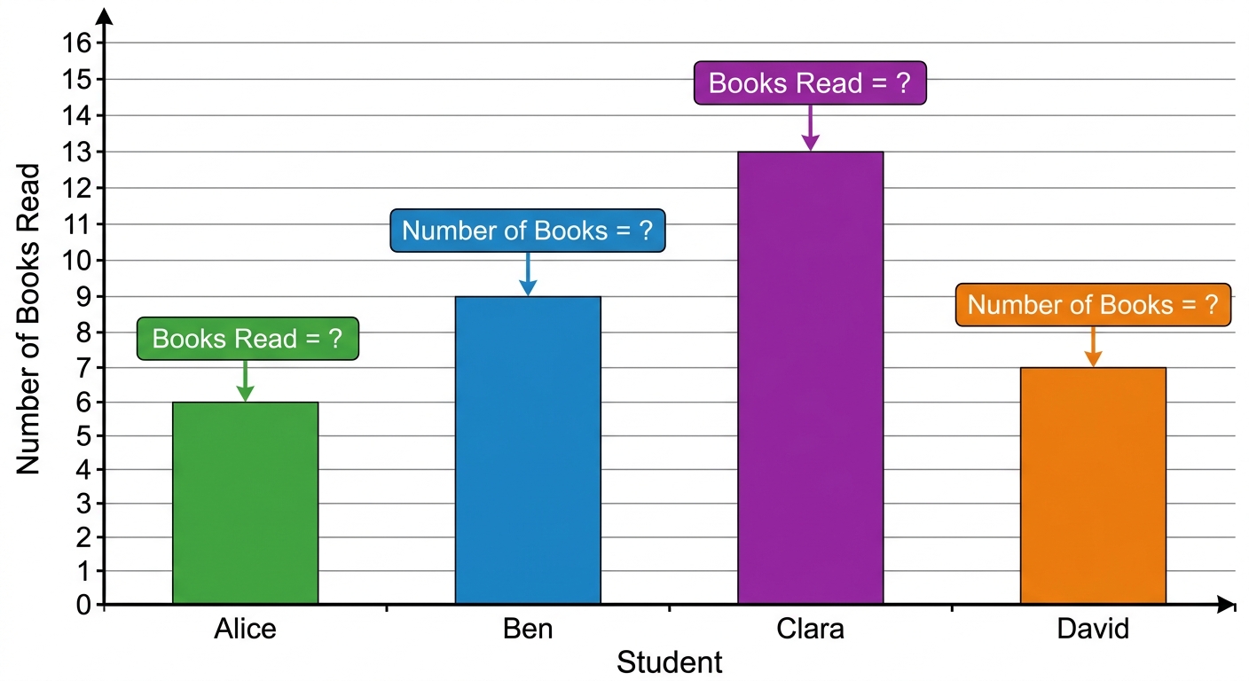
The bar chart shows the number of books read by four students in one month.
Alice: books, Ben: books, Clara: books, David: books
Alice: books, Ben: books, Clara: books, David: books
a
Identify the student who read the most books. [1]
b
Explain how the bar chart shows that this student read more books than the others. [1]

Solutions
2QuestionAvoiding Misleading GraphsAssessment Practice
4 marks~6 minCriterion D
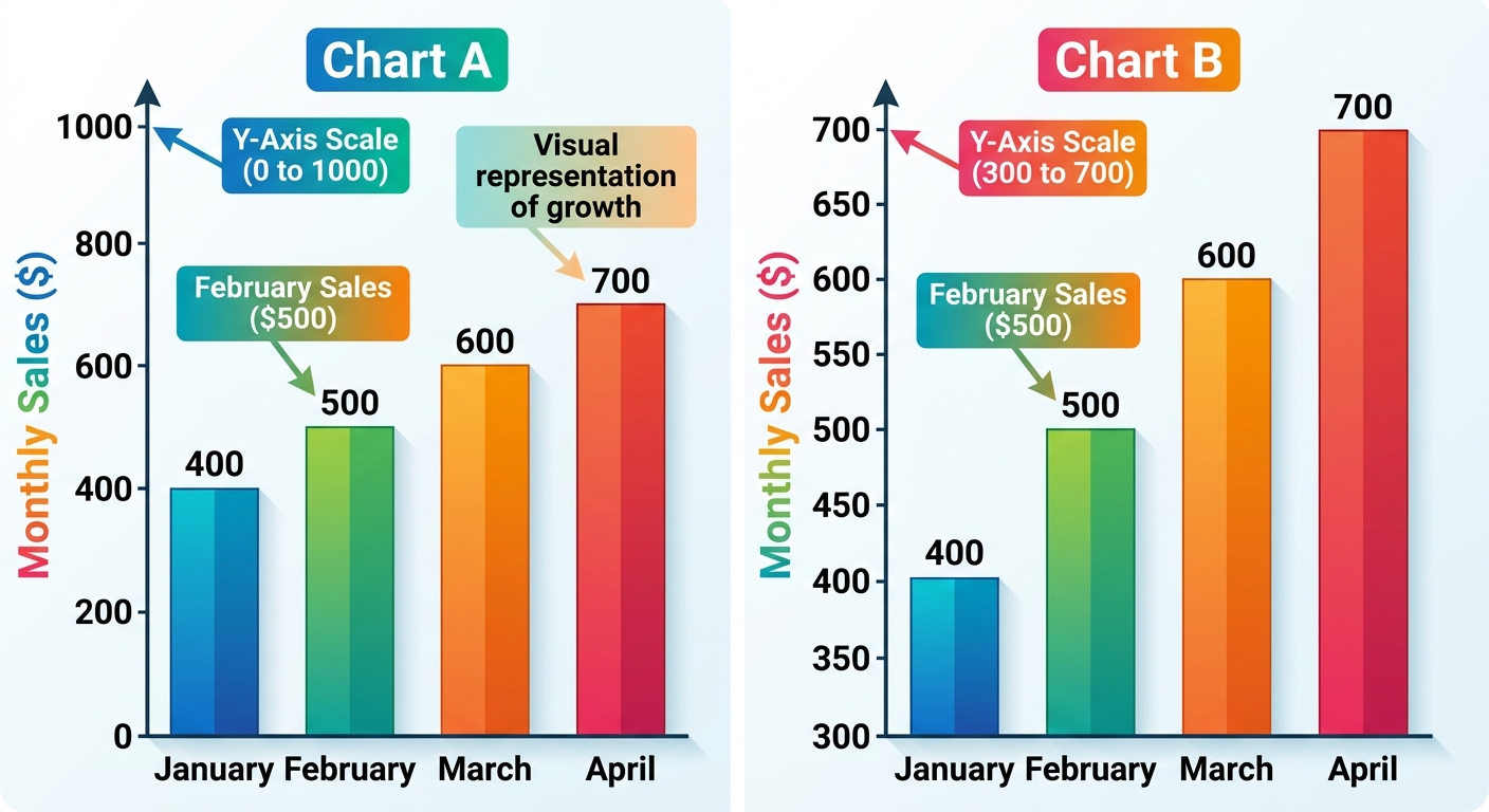
Two bar charts show the same monthly sales data (in dollars) for a small business from January to April.
Chart A: y-axis from to
Chart B: y-axis from to
Sales data (both charts): January: 400, February: 500, March: 600, April: 700
Chart A: y-axis from to
Chart B: y-axis from to
Sales data (both charts): January: 400, February: 500, March: 600, April: 700
a
Identify one difference in the y-axis scaling between Chart A and Chart B. [1]
b
Calculate the visual bar heights for January and April in Chart B, then find the visual ratio of April to January. [2]
c
Compare the visual ratio from Chart B with the actual sales ratio , and explain why Chart B may mislead a reader. [1]
Solutions
3QuestionJustifying Graph Choices in ReportsConcept Practice
2 marks~3 minCriterion B
The table below shows hours studied and test scores for five students.
| Hours studied | 1 | 2 | 3 | 4 | 5 |
|---|---|---|---|---|---|
| Test score (%) | 45 | 55 | 65 | 75 | 85 |
a
Identify the pattern in the test scores as hours studied increase. [1]
b
Explain why a line graph is a better choice than a bar chart to display this data. [1]
Solutions
4QuestionJustifying Graph Choices in ReportsAssessment Practice
5 marks~8 minCriterion C
The table below shows daily screen time and sleep hours for 12 MYP 2 students.
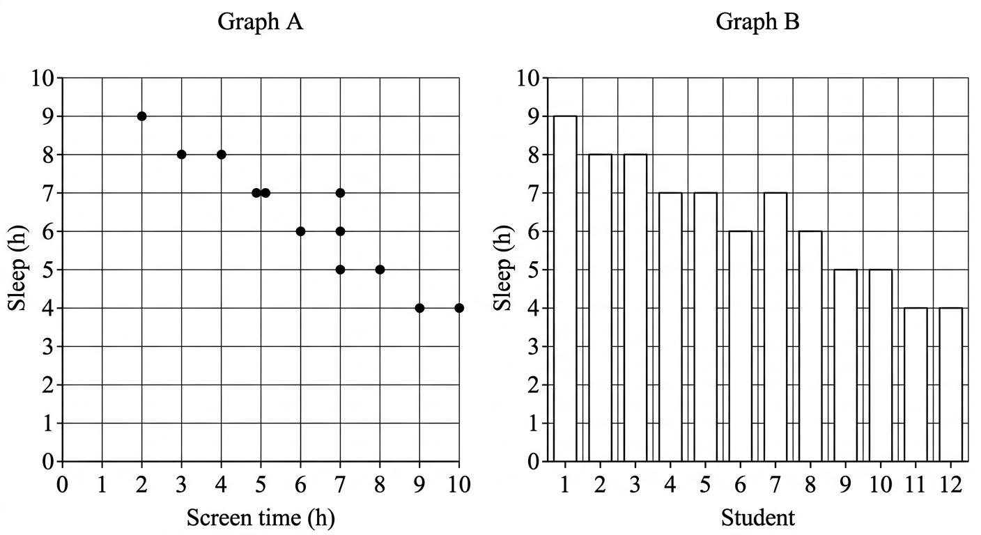
Two graphs of this data are drawn: a scatter plot with screen time on the x-axis and sleep hours on the y-axis, and a bar chart with each student as a separate bar showing their sleep hours.
| Screen time (h) | 2 | 3 | 4 | 5 | 5 | 6 | 6 | 7 | 7 | 8 | 9 | 10 |
|---|---|---|---|---|---|---|---|---|---|---|---|---|
| Sleep (h) | 9 | 8 | 8 | 7 | 7 | 6 | 7 | 6 | 5 | 5 | 4 | 4 |
Two graphs of this data are drawn: a scatter plot with screen time on the x-axis and sleep hours on the y-axis, and a bar chart with each student as a separate bar showing their sleep hours.
a
Identify the two variables being compared in this data set. [1]
b
Explain why the scatter plot is an appropriate graph for displaying this data. [2]
c
Compare the scatter plot and the bar chart. Explain why the bar chart is a less appropriate choice for showing the relationship between screen time and sleep hours. [2]
Solutions
That's every free question here — 4 of 62.
+58 more questions, plus Mock Papers & Worksheets, are waiting in Premium.