You're viewing free preview questions — 4 questions previewing here — subscribe to unlock 70 more, plus the Full Question Bank, Mock Papers & Worksheets.Upgrade
Choosing the Best Data Representation — Free MYP3 Mathematics Practice Questions

1QuestionMatching Data Types to Appropriate ChartsConcept Practice
2 marks~3 minCriterion A
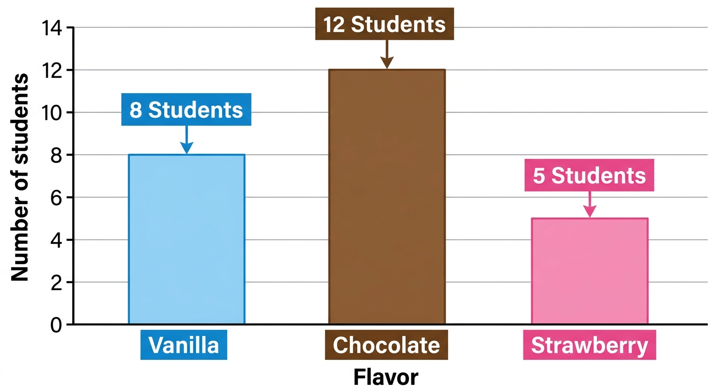
A class of students was asked to name their favourite ice cream flavour. The results are shown in the bar chart below.
| Flavour | Vanilla | Chocolate | Strawberry |
|---|---|---|---|
| Number of students | 8 | 12 | 5 |
a
Identify the type of data shown in the chart. [1]
b
Explain which flavour is the mode and why. [1]

Solutions
2QuestionAvoiding Misleading GraphsAssessment Practice
5 marks~8 minCriterion C
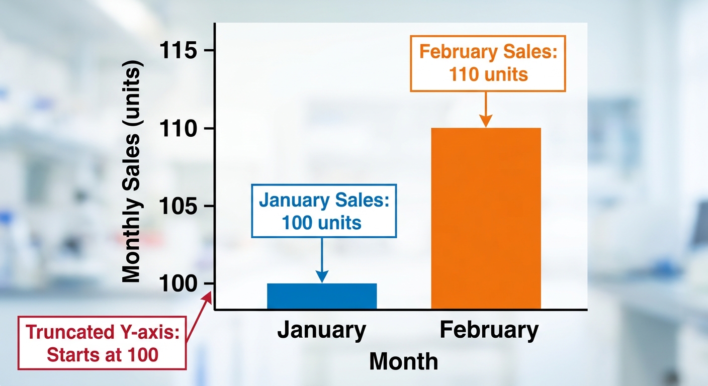
A bar chart shows a company's monthly sales. The y-axis starts at 100 instead of 0. January sales = 100 units; February sales = 110 units. A manager claims: "Sales doubled from January to February."
a
Describe what "doubled" means in terms of percentage increase. [1]
b
Calculate the actual percentage increase in sales from January to February using:
[2]
[2]
c
Analyse whether the manager's claim is valid. In your answer, refer to both your calculation and the effect of the y-axis starting at 100. [2]
Solutions
3QuestionAvoiding Misleading GraphsAssessment Practice
6 marks~9 minCriterion D
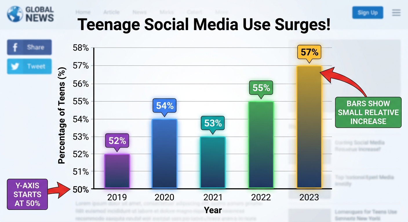
A news website publishes a bar chart titled "Teenage Social Media Use Surges!" showing the percentage of 13–17-year-olds who report using social media daily:
The y-axis starts at 50% instead of 0%.
| Year | 2019 | 2020 | 2021 | 2022 | 2023 |
|---|---|---|---|---|---|
| Percentage | 52% | 54% | 53% | 55% | 57% |
The y-axis starts at 50% instead of 0%.
a
Calculate the actual increase in percentage from 2019 to 2023. Describe how the truncated y-axis changes the appearance of this change. [2]
b
Explain how a policymaker who misreads this chart could make a poorly justified decision about school phone use. [2]
c
Analyse the bar chart to identify one way a reader could detect the misleading axis, and suggest one reason why the designer may have chosen to start the y-axis at 50%. [2]
Solutions
4QuestionAvoiding Misleading GraphsAssessment Practice
6 marks~9 minCriterion B
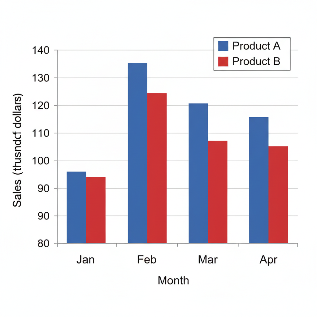
A company's January sales figures are:
Product A: 100 thousand dollars
Product B: 90 thousand dollars
A bar chart displays these values with the y-axis starting at 80.
Product A: 100 thousand dollars
Product B: 90 thousand dollars
A bar chart displays these values with the y-axis starting at 80.
a
Calculate the visual height ratio of Product A to Product B when the y-axis starts at 80. [1]
b
Calculate the actual value ratio of Product A to Product B. Explain why the two ratios differ and what this means for someone reading the chart. [3]
c
A second chart shows the same data with the y-axis starting at 50. Using the formula
where is the baseline, and , calculate the exaggeration factor and compare it with the exaggeration factor when . Analyse what this tells you about how the choice of baseline affects the perceived difference between the two products. [2]
where is the baseline, and , calculate the exaggeration factor and compare it with the exaggeration factor when . Analyse what this tells you about how the choice of baseline affects the perceived difference between the two products. [2]
Solutions
That's every free question here — 4 of 74.
+70 more questions, plus Mock Papers & Worksheets, are waiting in Premium.