You're viewing free preview questions — 4 questions previewing here — subscribe to unlock 53 more, plus the Full Question Bank, Mock Papers & Worksheets.Upgrade
Stem-and-Leaf Diagrams and Dot Plots — Free MYP3 Mathematics Practice Questions

1QuestionComparing Data Sets Using Dot PlotsConcept Practice
3 marks~5 minCriterion A
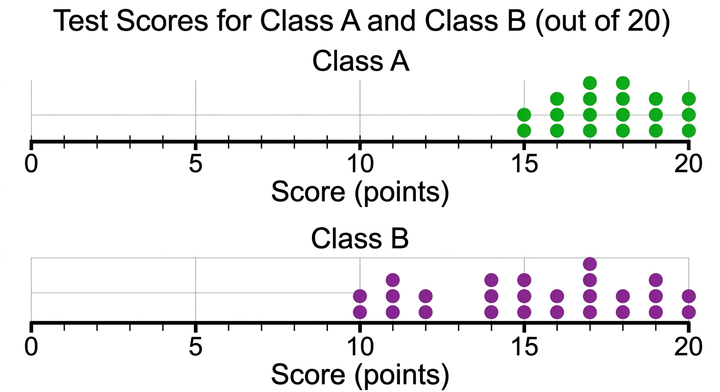
The dot plots below show the test scores (out of 20) for two classes.
Class A scores: 15, 16, 16, 17, 17, 17, 18, 18, 19, 20
Class B scores: 10, 11, 12, 14, 15, 16, 17, 18, 19, 20
Class A scores: 15, 16, 16, 17, 17, 17, 18, 18, 19, 20
Class B scores: 10, 11, 12, 14, 15, 16, 17, 18, 19, 20
a
Calculate the range of scores for Class A. [1]
b
Calculate the range of scores for Class B. [1]
c
Explain which class has more consistent scores. Use your results from parts (a) and (b) to support your answer. [1]

Solutions
2QuestionPlotting Dot Plots from Small Data SetsAssessment Practice
6 marks~9 minCriterion D
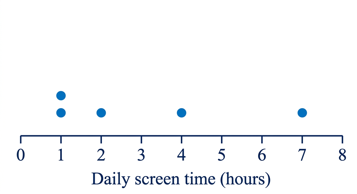
A school surveys 5 students about their daily screen time (in hours): 1, 1, 2, 4, 7.
A dot plot is created from this data. The school principal claims: "The average daily screen time for all students in the school is about 3 hours."
A dot plot is created from this data. The school principal claims: "The average daily screen time for all students in the school is about 3 hours."
a
Calculate the mean screen time for the 5 students. [1]
b
Explain why this dot plot and data set may not be suitable for supporting the principal's claim about the whole school. [3]
c
Analyse how the value of 7 hours affects the mean, and explain what a different average could be used to better represent the data. [2]
Solutions
3QuestionCreating and Interpreting Stem-and-Leaf DiagramsAssessment Practice
6 marks~9 minCriterion B
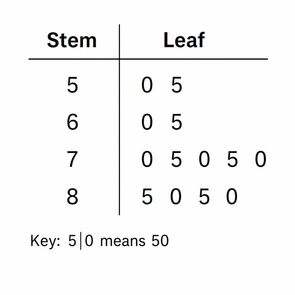
The stem-and-leaf diagram shows test scores from a class.
Key: 5 | 0 means 50
| Stem | Leaf |
|---|---|
| 5 | 0 5 |
| 6 | 0 5 |
| 7 | 0 5 0 5 0 |
| 8 | 0 5 0 5 |
Key: 5 | 0 means 50
a
List all the scores shown in the diagram in order from smallest to largest. [1]
b
Describe the pattern you notice in the scores. [2]
c
Predict the next three scores that continue the pattern. Construct an updated stem-and-leaf diagram that includes your predicted scores and explain why the pattern is still consistent. [3]
Solutions
4QuestionComparing Data Sets Using Dot PlotsAssessment Practice
6 marks~9 minCriterion C
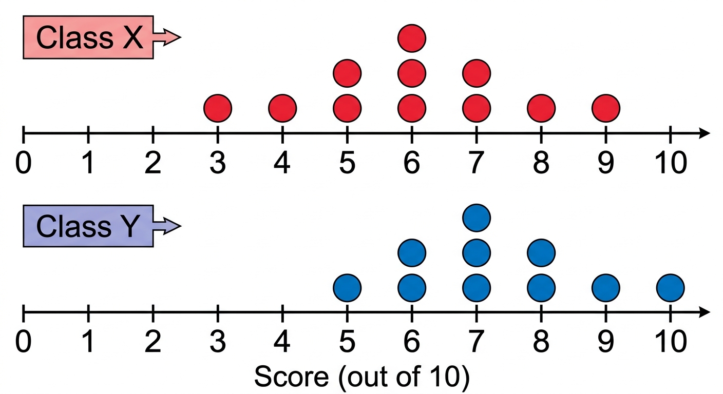
Two classes, Class X and Class Y, took the same mathematics test scored out of 10. The dot plots below show their results.
A student claims: "Class X performed better than Class Y because it has a higher median."
A student claims: "Class X performed better than Class Y because it has a higher median."
a
Calculate the median and range for each class. [2]
b
Compare the spread and clustering of scores in the two classes. Use your values from part (a) to support your comparison. [2]
c
Analyse whether the student's claim is correct. Use evidence from both the median and the range in your answer. [2]
Solutions
That's every free question here — 4 of 57.
+53 more questions, plus Mock Papers & Worksheets, are waiting in Premium.