You're viewing free preview questions — 4 questions previewing here — subscribe to unlock 72 more, plus the Full Question Bank, Mock Papers & Worksheets.Upgrade
Statistical Misuse and Real-World Applications — Free MYP3 Mathematics Practice Questions

1QuestionCommon Errors in Average InterpretationConcept Practice
2 marks~3 minCriterion A
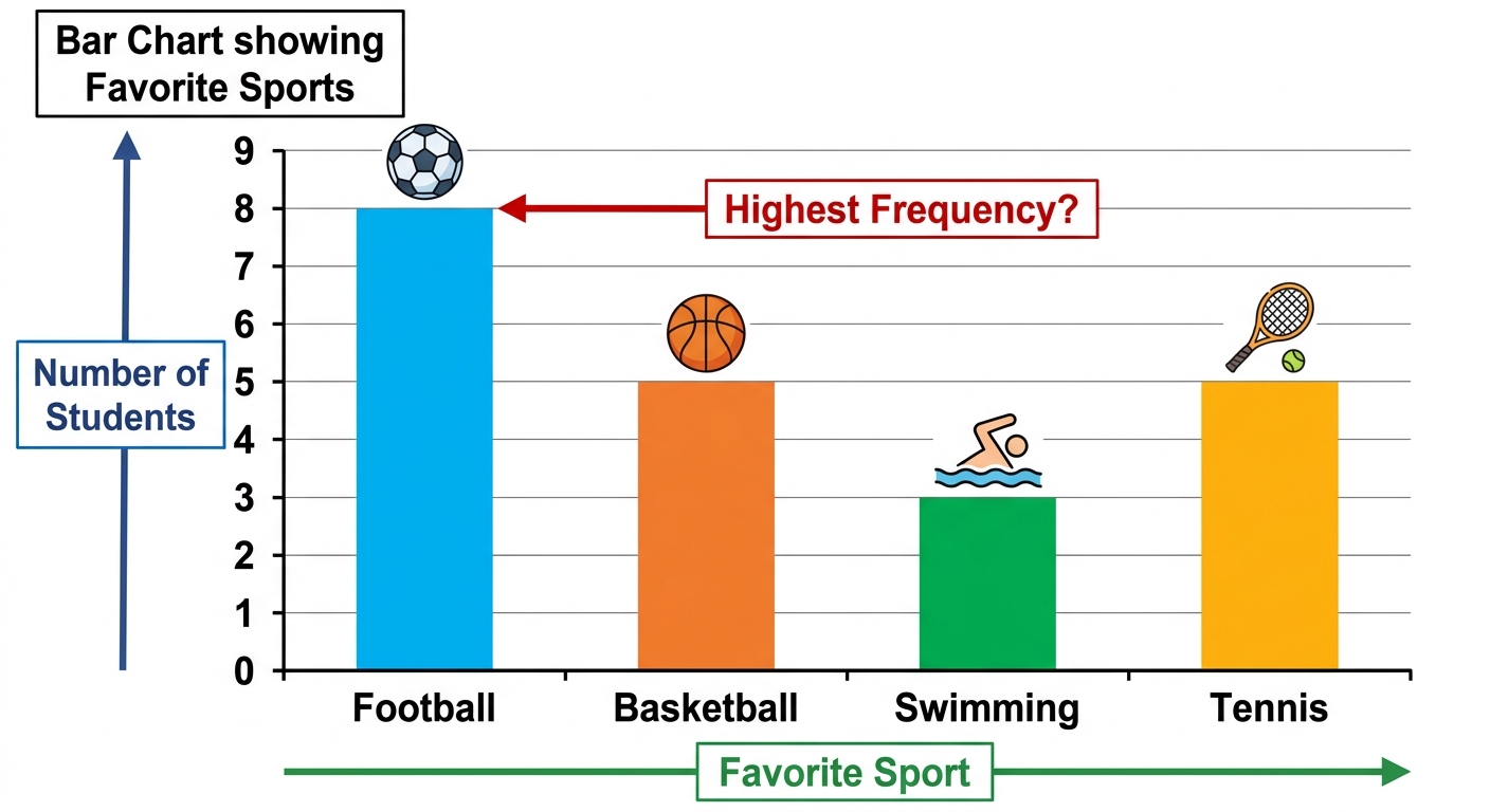
The bar chart below shows the favourite sports of students in a class.
Football: 8 students
Basketball: 5 students
Swimming: 3 students
Tennis: 5 students
Football: 8 students
Basketball: 5 students
Swimming: 3 students
Tennis: 5 students
a
State the mode of the favourite sports data. [1]
b
Explain why Football is the mode and not Basketball or Tennis, even though both have the same frequency as each other. [1]

Solutions
2QuestionManipulating Data for PersuasionAssessment Practice
6 marks~9 minCriterion C
A toothpaste advertisement claims: "Preferred by 4 out of 5 dentists!" The company surveyed only 10 dentists, all of whom were paid consultants for the company.
a
Describe what is meant by a representative sample and explain why this survey may not produce one. [2]
b
Explain how reporting (80%) rather than "8 out of 10 dentists" could mislead consumers. [2]
c
A consumer sees the advertisement and says: "80% of dentists prefer it — that's strong evidence!" Analyse this statement using the survey's sample size and data collection method. [2]

Solutions
3QuestionCommon Errors in Average InterpretationAssessment Practice
6 marks~9 minCriterion D
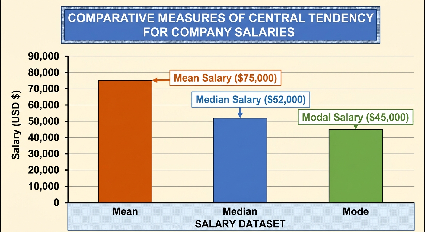
A company claims that the average salary at their firm is dollars per year. Further investigation reveals that the median salary is dollars and the mode is dollars.
a
Identify which measure of central tendency the company is most likely using to support their claim. [1]
b
Explain why the company might prefer this measure over the median or the mode. [2]
c
Analyse the limitations of using a single average to represent the salary data, and suggest two pieces of additional information that would give a more complete picture of the distribution. [3]
Solutions
4QuestionRecognizing Misleading GraphsAssessment Practice
8 marks~12 minCriterion B
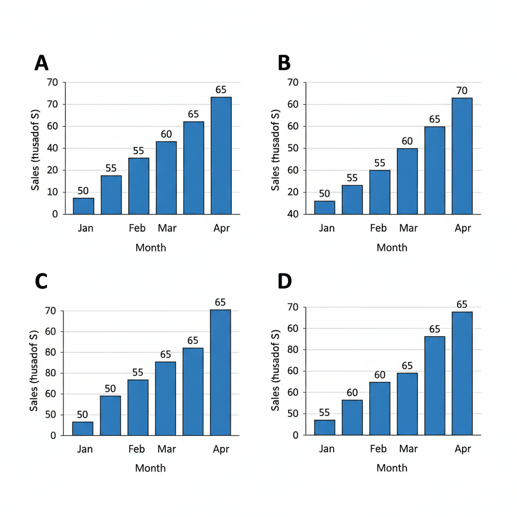
A small business records monthly sales (in thousands of dollars) for January to April: 50, 55, 60, 65.
Three bar charts display these data using different y-axis starting values:
Chart A starts at 0, Chart B starts at 40, Chart C starts at 48.
The bar height for any month actual value y-axis start.
Three bar charts display these data using different y-axis starting values:
Chart A starts at 0, Chart B starts at 40, Chart C starts at 48.
The bar height for any month actual value y-axis start.
a
Calculate the perceived percentage increase from January to April for Charts A and B, using:
[2]
[2]
b
Explain how raising the y-axis start value affects the visual impression of the increase shown in the charts. [2]
c
Analyse Chart C: using the formula from part (a), calculate the perceived percentage increase, then compare it with the actual percentage increase and explain what this reveals about the effect of a truncated y-axis. [4]
Solutions
That's every free question here — 4 of 76.
+72 more questions, plus Mock Papers & Worksheets, are waiting in Premium.