
Economics: The Limits of the Gini Coefficient
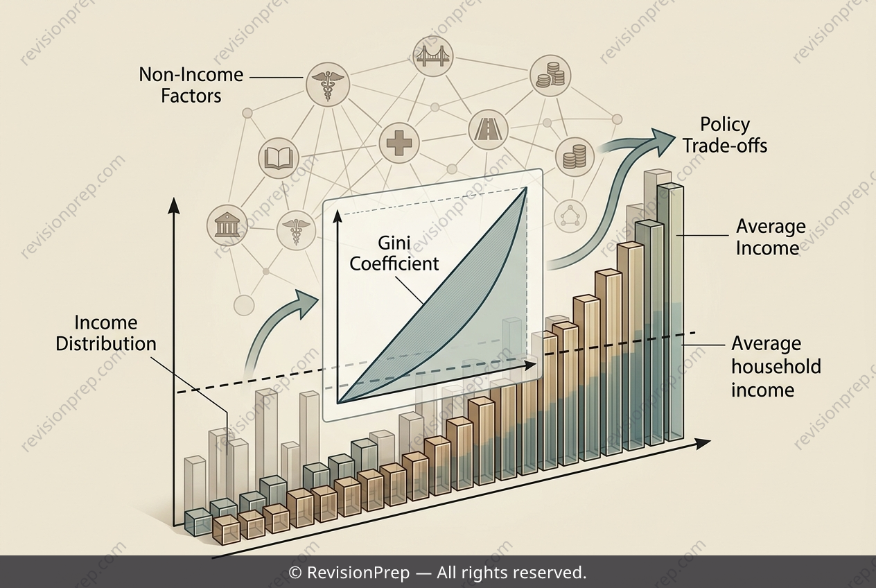
A single number can never tell the full story of inequality. The Gini coefficient, derived from the Lorenz curve as the ratio of the area between the curve and the line of perfect equality (A) to the total area under that line (A + B), condenses an entire distribution into one figure—like Kenya’s 0.47. But this snapshot hides crucial nuances: it does not reveal where inequality concentrates (urban versus rural, or regional pockets), nor does it capture income mobility over time. A household may move between quintiles, meaning a static Gini can overstate how entrenched disparity truly is. These limitations matter because policy hinges on interpretation. Pairing the Gini with an average income—say, USD 8,200 annually—can mislead if the distribution is skewed; the median earner may earn far less, so growth alone won’t lift the poorest. Conversely, redistribution without growth is constrained by a low income base. The two objectives are interdependent: tackling inequality requires both understanding the coefficient’s blind spots and recognising that averages obscure lived realities. Only by connecting the formula to its context can we grasp what the number truly measures—and what it leaves out.
Start practising IB questions today
150,000+ IB-styled questions, criteria-mapped and instantly accessible.