
Economics: What the Gini Coefficient Cannot Tell You
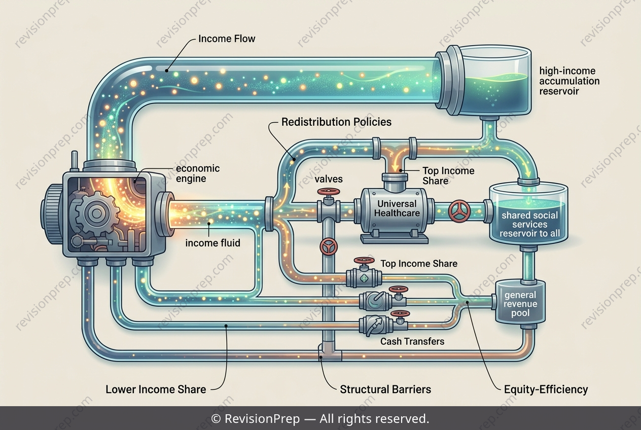
The Gini coefficient is a single number that claims to capture an entire country’s income distribution—but how much does it really tell us about fairness? In Country X, a developing Southeast Asian nation, the coefficient has fallen from 0.52 to 0.41 over a decade, suggesting progress. Yet beneath that headline figure lies a more complex story about who actually gained ground and who was left behind. This matters because income redistribution policies—like universal primary healthcare and means-tested cash transfers—target specific groups, not abstract averages. The data shows the bottom 40% of earners saw their income share jump from 12% to 18%, while the top 10% barely budged, slipping only from 38% to 35%. The Lorenz curve, which plots cumulative population against cumulative income, illustrates this: the new curve sits closer to the line of perfect equality, but remains sharply bowed at the upper end. The Gini aggregates all these shifts into one scalar, meaning a large improvement among the poor can mask persistent top-end concentration. Relative poverty stays high, and access to quality secondary education remains unequal—reminding us that structural inequality often resists simple statistical summaries.
Start practising IB questions today
150,000+ IB-styled questions, criteria-mapped and instantly accessible.