
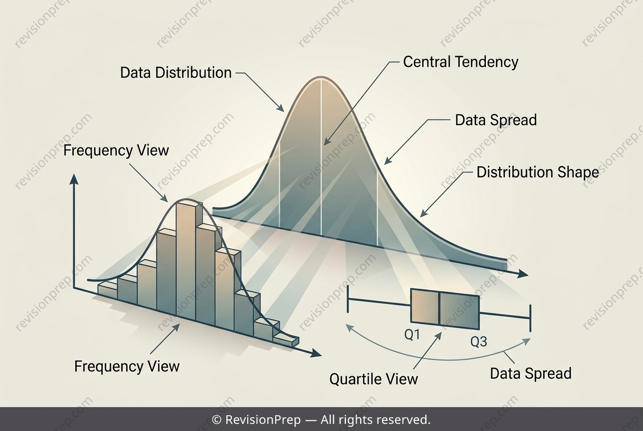
Maths: Reading Skew with Histograms and Box Plots
Comparing distributions is one of the most powerful ways to understand what a dataset is really telling you. In this exercise, we look at commute times for 100 people and explore how the same information can be visualised through a histogram and a box plot. The core idea is that while a histogram shows the shape of the frequency distribution across intervals, a box plot summarises the spread and central tendency using quartiles—specifically the median, Q₁, and Q₃. Together, these tools reveal whether data is symmetric or skewed, which is essential for making accurate inferences in real-world contexts like urban planning or resource allocation. The key relationship here is between cumulative frequency and the median’s location. By adding frequencies progressively (5, 20, 50, 75…), you can pinpoint where the 50th and 51st values fall, which directly determines the median interval. Meanwhile, the box plot’s whisker lengths and the median’s position relative to Q₁ and Q₃ provide a visual check: if the median sits closer to Q₁ and the upper whisker is longer, the distribution is positively skewed. Both representations should agree, reinforcing the idea that visualisation is not just about drawing graphs, but about reading the same story from different angles.
Start practising IB questions today
150,000+ IB-styled questions, criteria-mapped and instantly accessible.