
Maths: Frequency Tables - Organise and Summarise Data
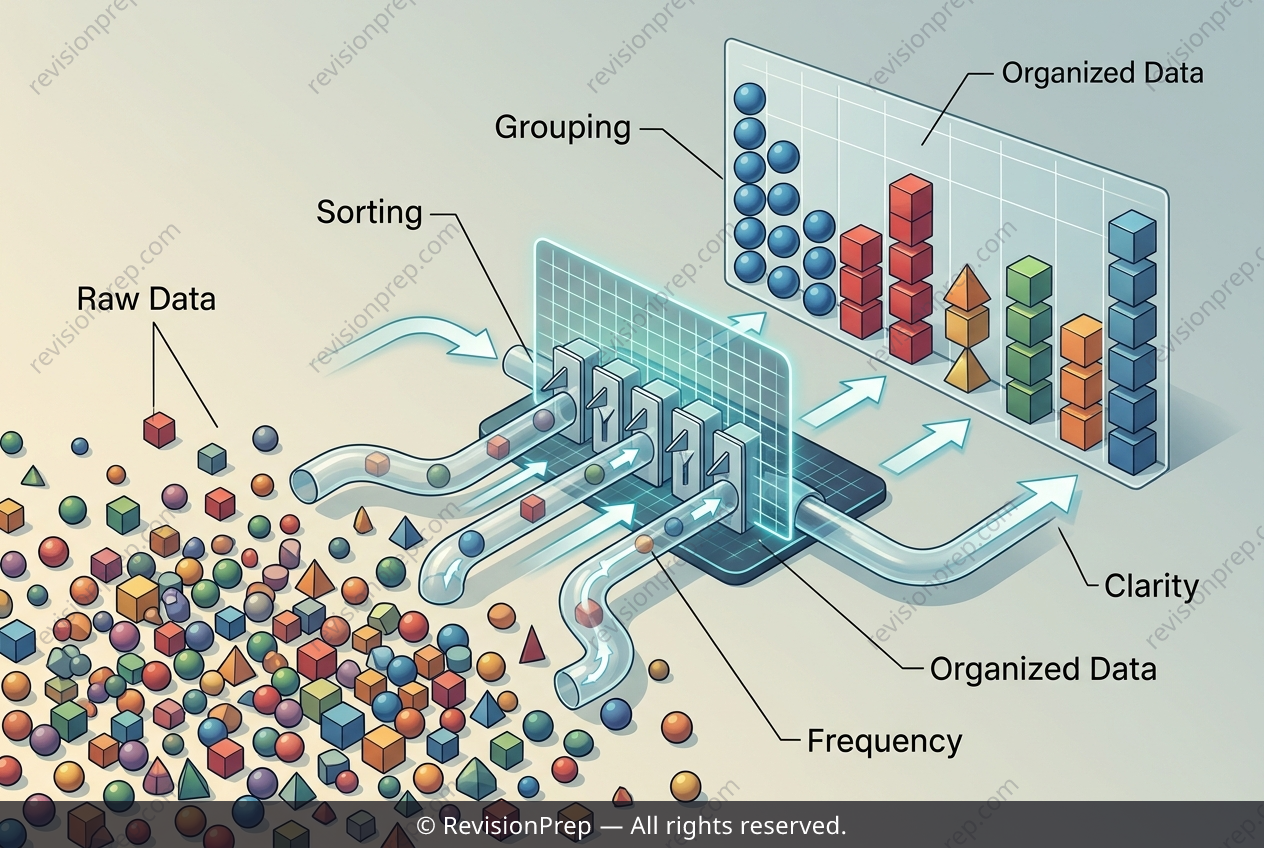
Raw data is messy. When you ask 20 students for their favourite colour, you get a list of responses in no particular order—red, blue, green, red again—and spotting patterns in that jumble is slow and error-prone. A frequency table is the first step in taming that chaos: it organises the raw data into distinct categories, sorting or grouping each response so that every colour appears exactly once as a heading. The real power of this table, though, lies in the second column: the frequency. This is simply a count of how many times each category occurs. By tallying the responses, the table transforms a scattered list into a clear summary—you can instantly see that “blue” appears 7 times while “yellow” appears 2, without re-reading every original entry. This connection between organisation (the categories) and summarisation (the frequencies) is what makes the data readable. Once you have that structure, you can compare values at a glance, identify the most and least popular choices, and prepare the data for further analysis like bar charts or pie charts. In essence, a frequency table doesn’t just tidy data—it turns raw observations into a tool for interpretation.
Start practising IB questions today
150,000+ IB-styled questions, criteria-mapped and instantly accessible.