
Maths: How Data Displays Turn Numbers into Insights
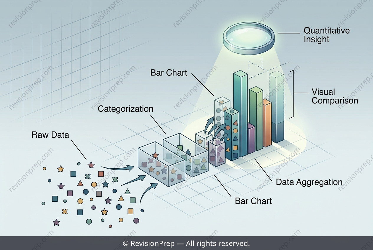
Data representation is the art of turning raw numbers into a visual story, and for IB Mathematics, mastering bar charts, line graphs, and pie charts is your first step toward fluent data analysis. Each chart type serves a distinct purpose: bar charts compare discrete categories through the height of their bars, line graphs reveal trends over continuous time, and pie charts show proportions of a whole as slices of a circle. The core skill lies not just in reading these visuals, but in extracting meaningful relationships—like spotting the tallest bar for a mode, or summing all slices to verify the total. The real power emerges when you connect the visual to the arithmetic behind it. For a bar chart, the height of each bar encodes a frequency, so comparing bars directly answers questions of popularity or preference. Meanwhile, the total of all bars equals the sum of all individual frequencies, a relationship that ties every category together into one complete dataset. Understanding this interplay—how each part contributes to the whole, and how the chart’s shape reflects underlying numbers—transforms a simple picture into a precise analytical tool. Whether you’re surveying lunch choices or tracking global temperatures, this foundational skill lets you translate visuals into conclusions with confidence.
Start practising IB questions today
150,000+ IB-styled questions, criteria-mapped and instantly accessible.