
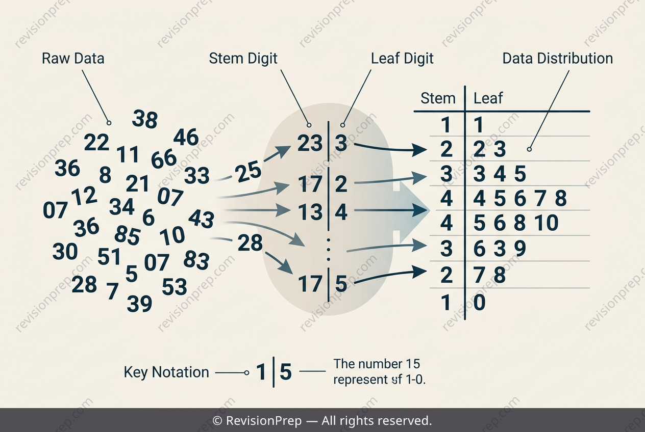
Maths: How Place Value Builds a Stem-and-Leaf Plot
When you first meet a stem-and-leaf diagram or a dot plot, you are looking at a snapshot of raw data that has been sorted just enough to reveal its shape. The core idea is structured quantitative data representation: instead of listing numbers in a jumbled set, you split each value into a stem (the leading digit or digits) and a leaf (the final digit). For lengths measured in centimetres, the stem typically holds the tens digit, while the leaf holds the ones digit. This simple split turns a messy list into an ordered, visual frequency table that still preserves every original data point. Why does this matter? Because these plots let you instantly see clusters, gaps, and the overall spread of a distribution without losing precision. The relationship between parts is key: a value like 24 cm and another like 27 cm share the same stem (2, meaning twenty-something), but their leaves (4 and 7) keep them distinct. In a dot plot, each dot stacks above a labelled axis, achieving the same goal—showing frequency and distribution—but with even less structure. Both tools are bridges between raw numbers and formal statistics, helping you compare groups or spot outliers before you calculate averages or standard deviations. Understanding how stems and leaves connect to place value is the first step to reading any quantitative dataset fluently.
Start practising IB questions today
150,000+ IB-styled questions, criteria-mapped and instantly accessible.