
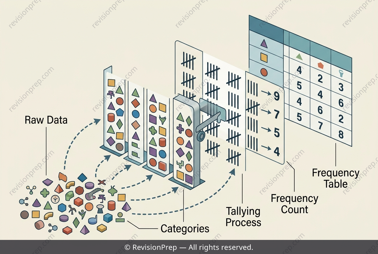
Maths: How Tally Charts Build Frequency Tables
Frequency tables and tally charts are the first step in turning raw, scattered data into something structured and readable. At their core, they ask a simple question: how often does each distinct value appear? By grouping observations into categories—like the number of pets owned—and counting their occurrences, you transform a list of individual answers into a compact summary that reveals patterns at a glance. This process matters because almost every branch of statistics, from probability to inferential testing, begins with organised data. A frequency table pairs each unique value with its count, creating a two-row relationship: the categories on top, the frequencies below. The tally chart acts as the visual counting mechanism, where each mark represents one observation, often grouped in fives for easy totalling. The key connection lies in the one-to-one correspondence between a tally’s final count and the frequency written in the table—no value should be skipped, and no count should be swapped between categories. Understanding this mapping ensures your table accurately mirrors the original data, forming a reliable foundation for later calculations like mean, mode, or range. Once you see how each tally mark becomes a number, the table stops being a mere chart and becomes a tool for insight.
Start practising IB questions today
150,000+ IB-styled questions, criteria-mapped and instantly accessible.