
Maths: Turning Chart-Reading Into Data Reasoning
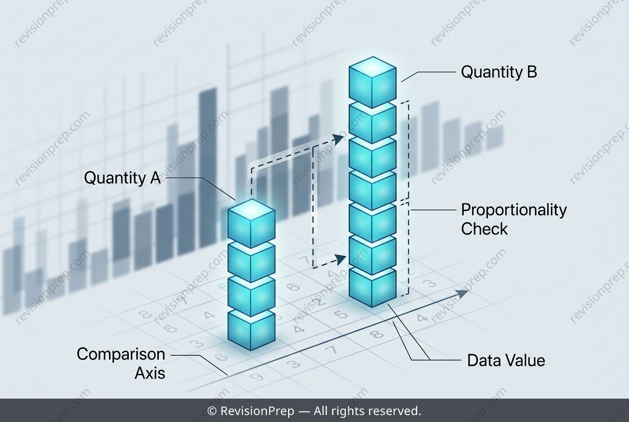
When you collect data, the first challenge is making sense of it—and that’s where charts come in. Bar charts, line graphs, and pie charts are three fundamental tools for visualising quantitative data, each with a distinct purpose. A bar chart compares discrete categories side by side, a line graph tracks changes over time, and a pie chart shows how a whole is divided into proportional parts. But reading a chart is only half the skill; the real power lies in comparing values and reasoning about relationships between them. This is where proportional reasoning enters the picture. When you look at a bar chart, you’re not just counting bars—you’re asking questions like “How many more?” or “Is this value double that one?” The core mechanism involves simple operations, such as multiplication (twice a value means 2 × that number) and equality checks (does one count equal another?). For instance, if you know the count for one category, you can double it and compare it directly to another category’s count. This comparison isn’t just arithmetic; it’s the foundation for interpreting claims about data, spotting patterns, and making evidence-based conclusions. Mastering this skill lets you move from passively seeing a chart to actively analysing what it tells you—and why.
Start practising IB questions today
150,000+ IB-styled questions, criteria-mapped and instantly accessible.