
Maths: Why Pie Chart Angles Must Total 360°
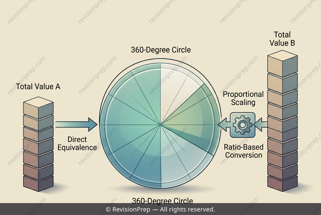
Pie charts are one of the most intuitive ways to visualise proportions, but their hidden rule is that every sector’s angle must add up to a fixed total: 360 degrees. This means a pie chart is not about raw amounts—it’s about how each part relates to the whole. When data is expressed in dollars, items, or people, the trick is to convert those quantities into angles that preserve their relative sizes, so the circle’s full rotation always represents the entire dataset. The core relationship here is simple: angle = (value ÷ total) × 360°. Because the full circle is 360°, a direct “one unit equals one degree” shortcut only works when the total of your data happens to equal 360. For instance, if a budget is split equally among four clubs, each sector’s angle is found by dividing the total degrees by the number of groups—but this works cleanly only because the total budget matches the angular sum. If the total changes, say to 480, that neat 1-to-1 mapping breaks: each dollar now represents less than one degree, so every angle must be recalculated using the proportional formula. This highlights why pie charts demand proportional thinking, not simple substitution—the circle’s fixed 360° is the anchor that keeps all sectors honest.
Start practising IB questions today
150,000+ IB-styled questions, criteria-mapped and instantly accessible.