
Maths: How Shape and Range Define Data Spread
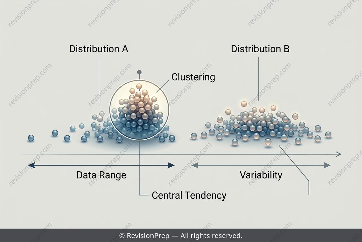
Comparing data distributions is about more than finding a single average — it is about understanding how values spread, cluster, and overlap across groups. Dot plots and stem-and-leaf diagrams make this visible, with each dot or leaf representing one data point, so patterns in the data become easy to spot. Two key measures frame any comparison: the range, found by subtracting the smallest value from the largest (range = highest − lowest), and the clustering of values, which reveals where most data points sit. These ideas matter because two datasets can share the same range yet tell very different stories. One group's scores might cluster tightly within a narrow band, suggesting consistent performance, while another's spread evenly across many values, indicating greater variability. Reading a distribution therefore means connecting its range to its shape — noticing gaps, clusters, and how evenly values are distributed. Together, these features allow meaningful comparisons between groups, showing not just how high or low scores go, but how reliably students perform.
Start practising IB questions today
150,000+ IB-styled questions, criteria-mapped and instantly accessible.