
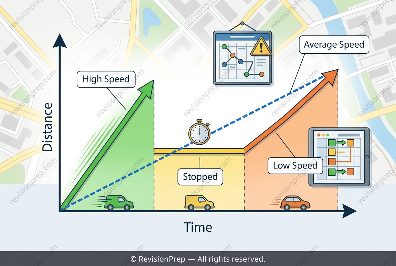
Maths: Why the Graph Tells More Than Average Speed
Distance-time graphs are more than just lines on a page—they are a visual story of motion, where the slope at any moment reveals the speed of the object. In this core concept, you learn to read that story: a steep, rising line means high speed (distance covered quickly), a flat, horizontal line means the object is completely stationary (speed = 0), and a gentle rise indicates slower movement. The key relationship is that speed equals the gradient of the graph, or change in distance divided by change in time, so every change in steepness directly reflects a change in velocity. Why does this matter beyond the classroom? Because real-life journeys—like a delivery driver’s 60 km urban route—are rarely uniform. The graph’s three distinct sections (fast, stopped, slow) capture the messy reality of traffic lights, unloading times, and congestion. If you only calculate the average speed using total distance divided by total time, you collapse all that variation into a single, tidy number. That number is mathematically correct, but it hides the crucial pauses and slowdowns that actually determine how long a route takes. Understanding this limitation is essential: average speed is a useful summary, but it is not a reliable predictor for planning schedules, because it cannot show when delays happen or why speed changes. The graph’s shape, not just its endpoints, holds the true insight.
Start practising IB questions today
150,000+ IB-styled questions, criteria-mapped and instantly accessible.