
Data Handling and Representation
From messy raw data to clear charts — the MYP 2 pipeline explained simply
Quick facts
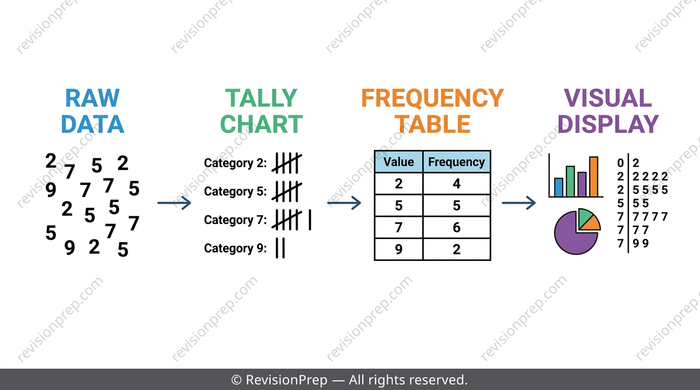
Every MYP 2 data handling question follows the same journey: raw data gets organised into a tally chart, then a frequency table, and finally turned into a visual display. Get the classification of your data wrong — discrete, continuous, or categorical — and every step afterwards falls apart, even with perfect arithmetic. This teaser walks through the five ideas examiners test most: tally charts and frequency tables, the three core chart types (bar, line, pie), stem-and-leaf diagrams and dot plots, and the classification decision that drives all of it. You'll see the exact traps IB MYP setters plant, like unequal class intervals and tied modal classes, plus the checks that catch them before you lose marks. For the full worked examples, formulas, and practice with answers, the complete revision note is linked below.
What you’ll be able to do
The Data Handling Pipeline: Why Classification Comes First
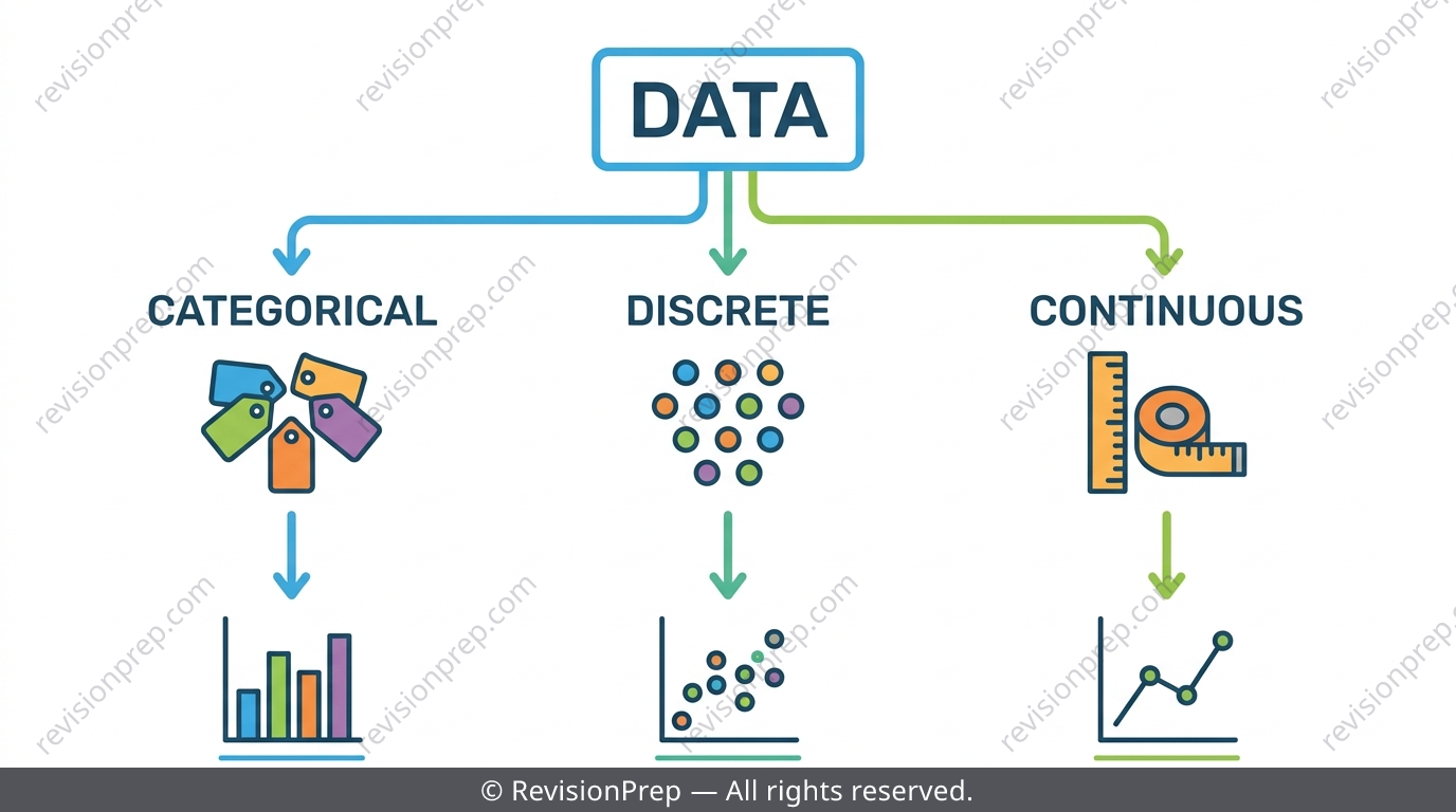
Data handling in MYP 2 is one continuous chain: raw data → organised table → visual display → interpretation. The single decision that drives every later choice is whether your data is discrete, continuous, or categorical — get this wrong at the start and every chart you draw afterwards is built on the wrong foundation. A raw list of 20 or 30 responses is hard to read at a glance, which is exactly why organising it comes first.
Exam tip
Before drawing anything, ask: are these labels (categorical), counted whole numbers (discrete), or measured values (continuous)? That answer decides your whole approach.
Mini summary
Classify your data type first — it determines every organisational and display choice that follows.
Frequency Tables and Tally Charts
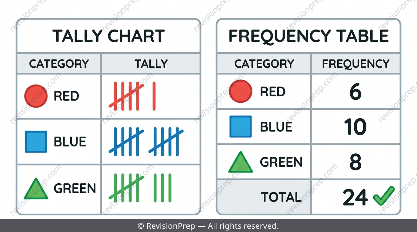
A tally chart records one stroke per occurrence as you work through raw data, grouped in bundles of five (four vertical strokes plus a diagonal fifth) so large counts are fast and less error-prone. A frequency table then converts those strokes into a clean count per category or value. When numerical data has many distinct values, group them into equal-width class intervals instead of listing every value separately.
Exam tip
Always sum the frequency column and check it equals the total number of data items — this single check catches most tallying errors before you lose marks.
Common mistake
Counting tally strokes one at a time instead of grouping them in fives — always draw the fifth stroke diagonally across the previous four, then count in fives plus leftovers.
Mini summary
Tally in order through the data, group in fives, and always verify the total against the original count.
Bar Charts, Line Graphs and Pie Charts
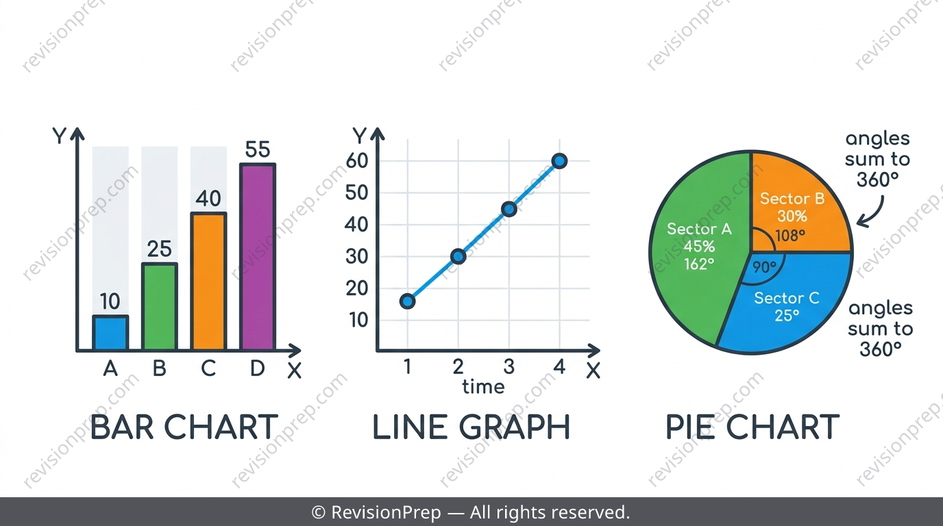
Once data is in a frequency table, the next tested decision is which chart suits it. A bar chart uses separate bars with visible gaps to compare category sizes; a line graph joins points to show a trend over time; a pie chart splits a circle into sectors proportional to each category's share of the total. The sector angle formula is .
| Feature | Bar Chart | Line Graph | Pie Chart |
|---|---|---|---|
| Shows | Compare categories | Trend over time | Proportion of whole |
| Bars/points | Separate, gaps between bars | Points joined with lines | Sectors of a circle |
| X-axis | Categories | Time or sequence | No axis — full circle |
Exam tip
'Compare' answers need direction and magnitude, not just two numbers side by side — say which is more popular and by roughly how much.
Common mistake
Drawing bar chart bars touching with no gaps — gaps are compulsory to signal separate/categorical data; only histograms have touching bars.
Mini summary
Bar charts compare categories, line graphs show trends, pie charts show proportion — and all pie angles must sum to 360°.
Stem-and-Leaf Diagrams and Dot Plots
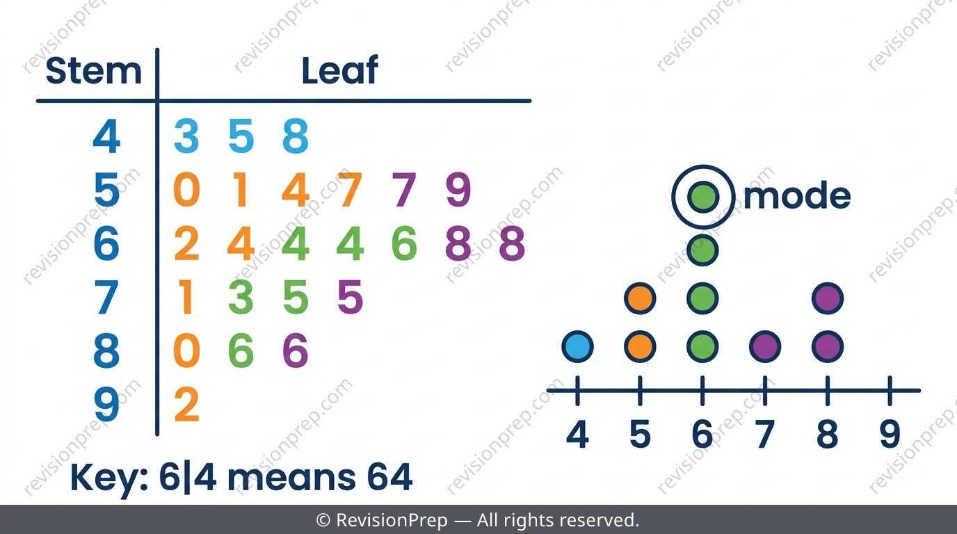
A grouped frequency table loses individual values once they're filed into a class interval — a stem-and-leaf diagram avoids that by keeping every original value visible while still organising by size. The stem is the leading digit(s), the leaf is the final digit, and every diagram needs a key like 'Key: 6|4 means 64'. In an ordered stem-and-leaf, leaves are arranged smallest to largest in each row, letting you read off the median and mode directly. Dot plots stack one dot per value above a number line and suit a small range of simple discrete values.
Exam tip
Always write the key before doing anything else with a stem-and-leaf diagram — without it, the diagram is meaningless to anyone reading your work.
Common mistake
Forgetting to re-sort leaves within each row after the first pass — an unordered diagram still shows correct data but makes reading the median or mode much harder.
Mini summary
Stem-and-leaf diagrams and dot plots keep every value visible while still organising data by size — perfect for reading off median and mode.
Putting It Together: Choosing the Right Display
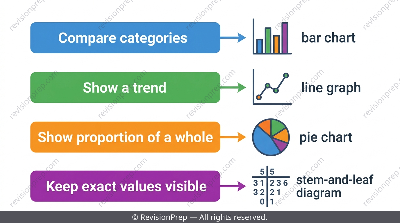
The whole topic comes down to matching the data type and purpose to the right tool: categorical or small discrete data suits a frequency table and bar chart, data over time suits a line graph, proportions of a whole suit a pie chart, and data where individual values matter suits a stem-and-leaf diagram or dot plot. Examiners deliberately test this decision, not just your drawing skill.
Exam tip
When class intervals are given, always check the last interval is genuinely the same width as the others before using it — examiners plant unequal-width traps here.
Mini summary
The right display depends on your data type and what you need to show — comparison, trend, proportion, or exact values.
Quick formula sheet
Practice questions
- Explain why tally marks are grouped in bundles of five rather than counted individually.
- State whether 'favourite pet' data is categorical, discrete, or continuous.
- Name the chart type best suited to showing a trend over several months.
- A survey of 20 students gives Football = 8, Basketball = 6, Tennis = 6. Calculate the sector angle for Tennis in a pie chart.
- Explain why a bar chart must have gaps between its bars while a histogram does not.
- Given class intervals 10–19, 20–29, 30–39, explain how you would check they are all equal width.
- A set of test scores has two class intervals tied for the highest frequency. Explain how you would report the modal class(es) correctly.
- Construct an ordered stem-and-leaf diagram for 15 values of your choice and use it to identify the median.
- A grouped frequency table hides individual values within class intervals. Explain, with an example, what information is lost and how a stem-and-leaf diagram avoids this.
Frequently asked questions
What is the difference between a tally chart and a frequency table?+
A tally chart records raw strokes as you go through the data, grouped in fives; a frequency table then converts those strokes into a final numerical count per category or value.
When should I use class intervals instead of listing every value?+
Use class intervals when numerical data has many different values, such as 25 test scores ranging from 34 to 95 — grouping into equal-width bands like 30–39, 40–49 keeps the table manageable.
How do I know whether to draw a bar chart, line graph, or pie chart?+
Use a bar chart to compare separate categories, a line graph to show change over time or sequence, and a pie chart to show how parts make up a whole.
Why does a stem-and-leaf diagram need a key?+
Without a key like 'Key: 6|4 means 64', there's no way for a reader to know how to convert the stem-and-leaf digits back into the original values.
Can a data set have more than one mode or modal class?+
Yes — ties are common and are often deliberately tested, so always check every row of a frequency table before naming the mode or modal class.
What's the formula for finding a pie chart sector angle?+
Sector angle equals frequency divided by total frequency, multiplied by 360°, since a full pie chart represents the whole circle.
Master Data Handling with the Full MYP 2 Revision Notes
Related articles