
Data Handling and Representation
Collect, organise and represent data the right way — every time, for every chart type.
Quick facts
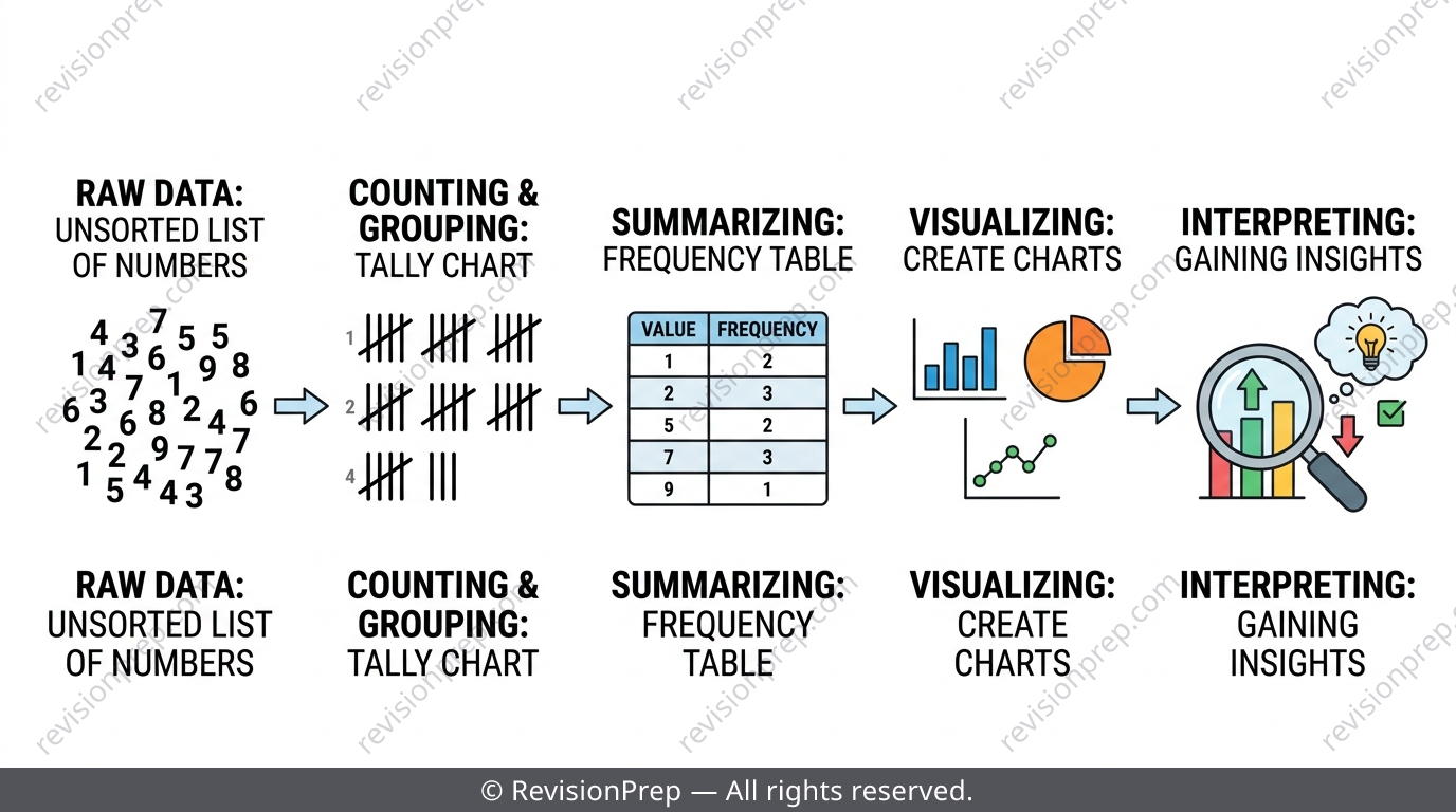
Data handling and representation is one of the most predictable topics in MYP 3 Mathematics — and one of the easiest to lose marks on if you rush. Every question follows the same pipeline: collect raw data, organise it into a frequency table, then represent it as a bar chart, line graph, pie chart, stem-and-leaf diagram or dot plot before interpreting what it shows. Examiners under Criterion A and Criterion D don't just want a correctly drawn chart — they want you to justify why that chart suits the data type in front of you. This teaser walks through the five ideas that come up again and again: frequency tables, choosing between bar/line/pie charts, stem-and-leaf and dot plots, the key formulas behind them, and the traps that quietly cost the most marks. For the full worked examples, class-interval walkthroughs and practice sets, the complete revision notes are linked below.
What you’ll be able to do
The Data Handling Pipeline
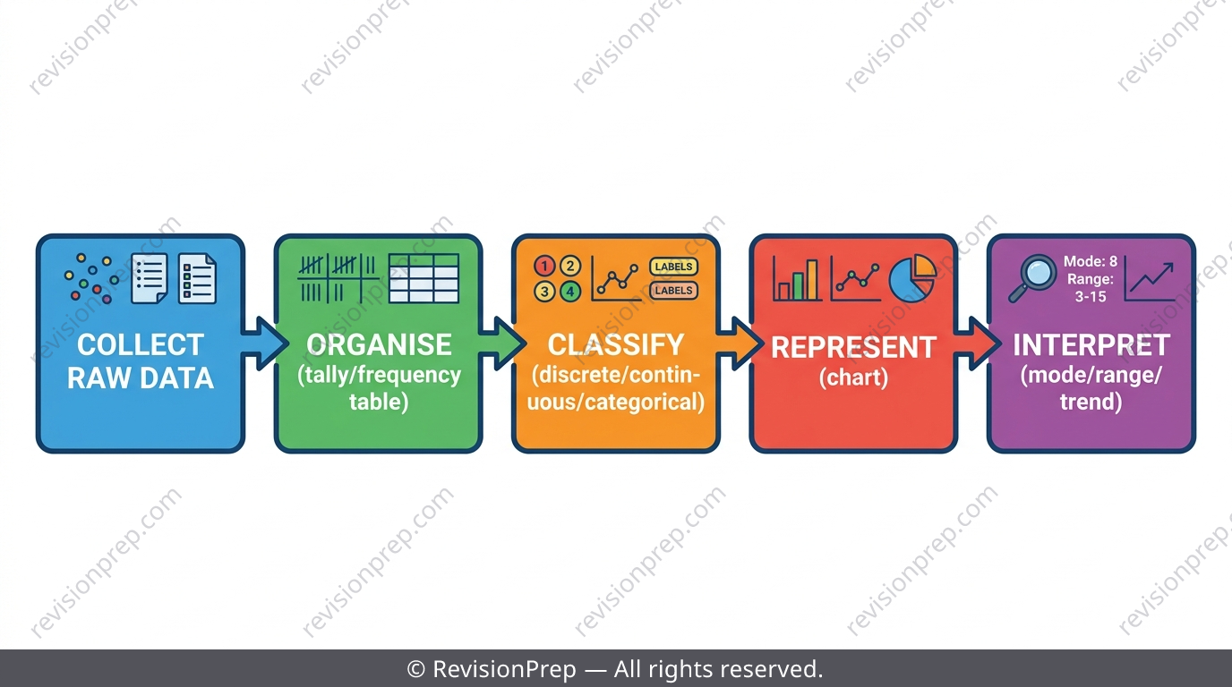
Every data question moves through the same five stages: collect, organise, classify, represent, interpret. Raw data — the unsorted list you're first given — is almost never usable until it's tallied into a frequency table. Examiners test each stage separately, so knowing which stage a question is asking about (via its command term) matters as much as the maths itself.
Exam tip
Command terms like 'construct', 'complete', 'explain' and 'analyse' each need a different depth of answer — this is the single biggest source of dropped marks in the unit.
Mini summary
Data always flows collect → organise → classify → represent → interpret.
Frequency Tables and Tally Charts
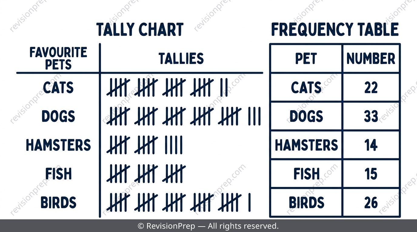
A tally chart counts raw data in one continuous pass, bundling strokes in fives for instant addition. Ungrouped tables use one row per distinct value (e.g. dice outcomes); grouped tables sort numerical data into equal-width class intervals like 40–49, 50–59 when there are too many distinct values to list individually.
| Table type | When to use | Example |
|---|---|---|
| Ungrouped | Few distinct values or categories | Favourite colours, dice rolls |
| Grouped | Many distinct numerical values | Test scores 0–100 in intervals of 10 |
Exam tip
Before answering later parts, sum the frequency column and compare it to the total sample size — a mismatch means a tally was double-counted or missed.
Common mistake
Misplacing a boundary value — e.g. putting 70 into '60–69' instead of '70–79'. Always check the lower bound belongs to its own interval, not the one below.
Mini summary
Tally in one clean pass, keep class widths equal, and always check the frequency total.
Bar Charts, Line Graphs and Pie Charts
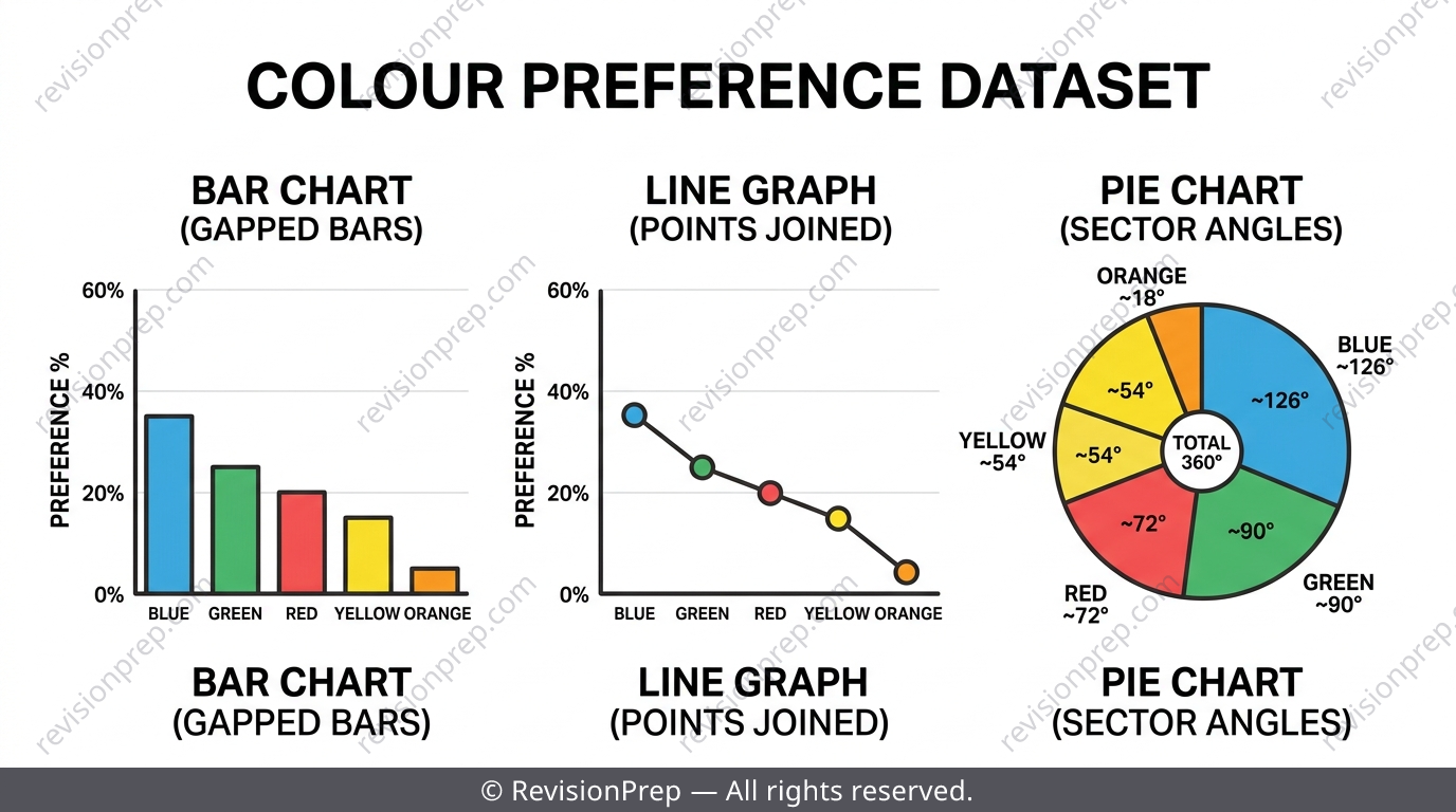
These three charts answer different questions. A bar chart compares separate categories (bars have gaps because categories are unordered). A line graph shows change over a continuous variable like time, with points joined by straight segments. A pie chart shows proportions of a whole, where each sector angle is and all angles must sum to .
| Feature | Bar Chart | Line Graph | Pie Chart |
|---|---|---|---|
| Shows | Category comparison | Change over time | Proportion of a whole |
| X-axis type | Categorical | Continuous | N/A (sectors) |
| Breaks with many categories? | Less badly | Not applicable | Yes — becomes unreadable |
Exam tip
Average rate of change between two points on a line graph uses end-point to end-point — never the gradient of just one visually 'typical' segment.
Common mistake
Drawing a pie chart for 8+ categories (like 10 favourite subjects) makes tiny slivers unreadable — group small categories into 'Other' or switch to a bar chart instead.
Mini summary
Bar = compare categories, line = show change over time, pie = show proportions of a whole.
Stem-and-Leaf Diagrams and Dot Plots
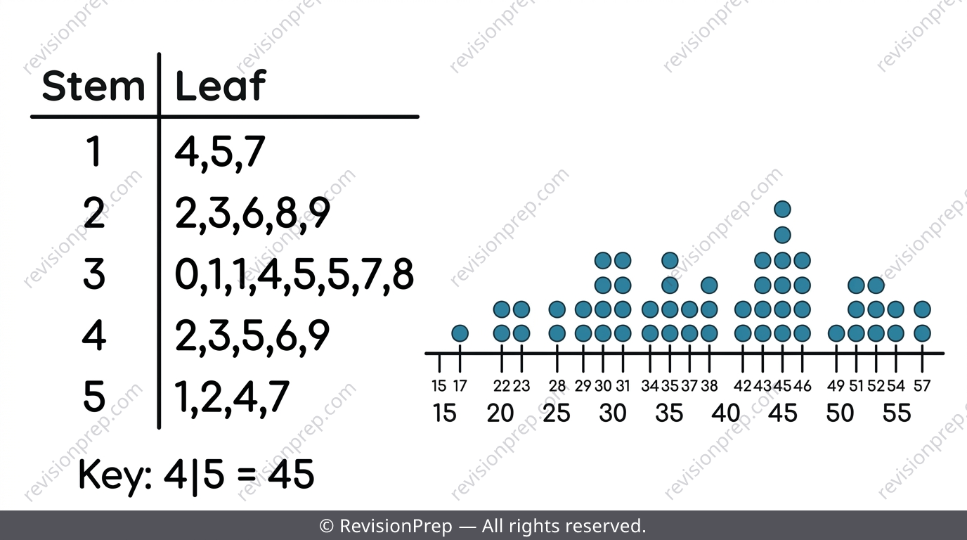
Unlike grouped frequency tables, both of these keep every individual value visible. A stem-and-leaf diagram splits each number into a stem (leading digits) and a leaf (last digit), with leaves written in ascending order within each row and a compulsory key like '4 | 5 = 45'. Dot plots stack one dot per value above a number line and suit discrete data with a manageable range, like shoe sizes rather than test scores out of 100.
Exam tip
Both diagrams let you read mode, range and shape directly — no extra calculation needed, so use them to sanity-check answers from other parts of a question.
Common mistake
Writing leaves out of ascending order within a stem row — this loses presentation marks even when every digit is correct.
Mini summary
Stem-and-leaf and dot plots preserve every data value while still revealing shape and mode.
Choosing the Right Representation
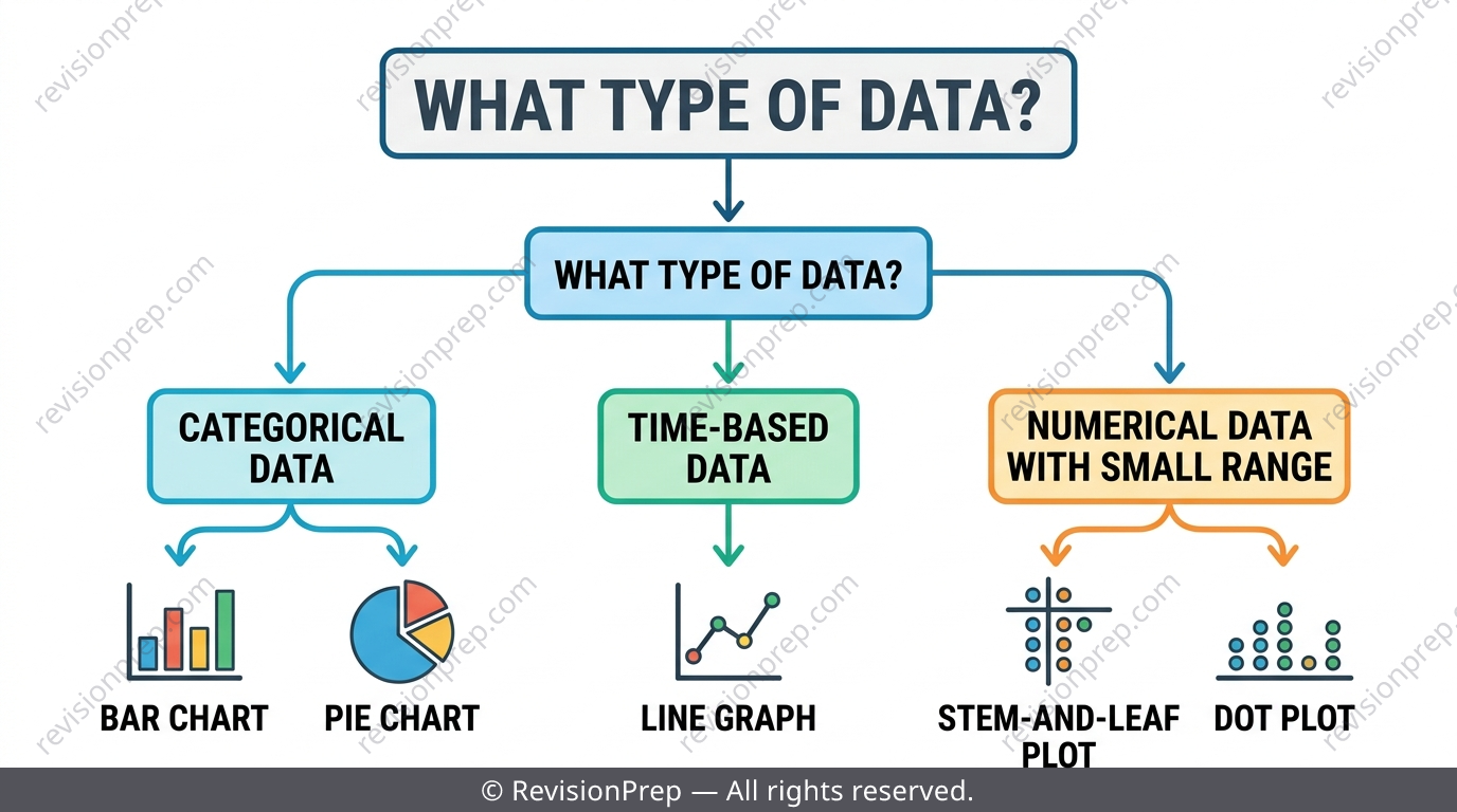
The single most examined skill in this unit isn't drawing a chart — it's justifying why that chart fits the data. Categorical data with few groups suits bar or pie charts; numerical data over time suits line graphs; numerical data with a manageable spread suits stem-and-leaf or dot plots; large numerical ranges need grouped frequency tables first.
Exam tip
When asked to 'identify' the most or least frequent category, give the category name — not the frequency number that helped you find it.
Mini summary
Match the chart to the data type first — the 'easiest to draw' chart is rarely the right justification.
Quick formula sheet
Practice questions
- Define 'frequency' and 'class interval' in your own words.
- State one situation where a bar chart is more suitable than a pie chart.
- What must a stem-and-leaf diagram always include alongside the stems and leaves?
- A survey of 24 students' favourite fruit gives: Apple 9, Banana 6, Orange 5, Grape 4. Calculate the pie chart angle for Apple.
- Explain why a class width of 10 is suitable for test scores ranging from 45 to 93.
- A dot plot shows shoe sizes 4 to 8 for 15 students. Explain why a dot plot is a better choice here than a stem-and-leaf diagram.
- A die is rolled 30 times and outcome 2 appears one more time than expected. Explain whether this supports the die being biased, referencing sample size.
- Angles for four pie chart sectors are calculated as 91°, 108°, 72°, and 88°, summing to 359°. Explain how to correct this and adjust the appropriate sector.
- A line graph shows temperature at four time points. The gradient between two middle points is steeper than the overall trend. Explain why using that segment alone to estimate the average rate of change over the full period is incorrect.
Frequently asked questions
What is the difference between a grouped and ungrouped frequency table?+
An ungrouped table has one row per distinct value or category, used when there aren't many different values. A grouped table sorts numerical data into equal-width class intervals when there are too many distinct values to list one by one.
How do you know which chart to use for a data set?+
Match the chart to the data type: bar charts compare separate categories, line graphs show change over a continuous variable like time, and pie charts show proportions of a meaningful whole — only when there aren't too many categories.
Why must pie chart angles sum to 360°?+
A pie chart represents the whole data set as one full circle, so every sector's angle, calculated using , must add up to exactly .
Why is a stem-and-leaf diagram better than a grouped frequency table sometimes?+
A stem-and-leaf diagram keeps every individual data value visible, while a grouped frequency table loses exact values once they're placed into a class interval.
What's the most common mistake in frequency table questions?+
Miscounting during tallying or misplacing a boundary value into the wrong class interval — always total the frequency column against the sample size before moving on.
Can a small sample size prove a die is biased?+
No — a small number of trials, like 30 rolls, is far too small to conclude bias from a slightly higher or lower frequency in one outcome.
Master Data Handling with the Full MYP 3 Revision Notes
Related articles