
Statistics – Averages and Analysis
Grouped data, missing values, box plots and spotting misleading stats for IB MYP 3 Maths
Quick facts
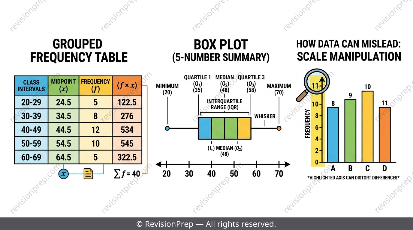
Statistics questions in IB MYP 3 Maths rarely just ask you to calculate a mean — they ask you to reason about it. You'll organise raw data into grouped tables, work backwards from a given average to find a missing value, summarise spread with box plots and interquartile range, and judge whether a statistic is actually fair. The formulas themselves — midpoint, estimated mean, IQR — are simple tools; the real marks come from explaining what your number means and where it can go wrong. This teaser walks through the five ideas examiners test most under Criterion A and Criterion D: grouping data, estimating a mean from a table, reverse-engineering missing values, reading box plots correctly, and spotting how averages and graphs can mislead. For full worked examples, trap-avoidance drills and mock exam-style questions, the complete revision note is linked below.
What you’ll be able to do
Grouping Data: Trading Precision for Readability
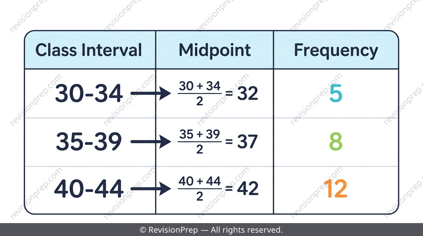
When you have hundreds of raw values, grouping them into class intervals (like 30–34, 35–39...) makes the shape of the data visible at a glance. But grouping is a one-way trade: once values are grouped, the exact originals are gone, and every calculation from that table afterwards is an estimate. All class intervals in one table must share the same width so histogram bars stay fairly comparable.
| Data type | Example interval | Meaning | Boundary value goes in |
|---|---|---|---|
| Continuous (height, mass) | 140 ≤ h < 150 | Non-overlapping inequality | The lower interval only |
| Discrete (test scores, ages) | 10 ≤ x ≤ 19 | Inclusive integers | Next interval starts at 20 |
Exam tip
If asked what a histogram bar's height represents, use the word 'frequency' explicitly — 'the number of students whose score falls in that interval.' Vague answers like 'it shows the scores' lose the mark.
Common mistake
Using one giant interval (e.g. ages 6–18 in one group) hides the shape entirely — it's technically grouped but tells you nothing useful.
Mini summary
Grouping reveals shape but loses exact values — keep class widths equal.
Estimating the Mean from a Grouped Table
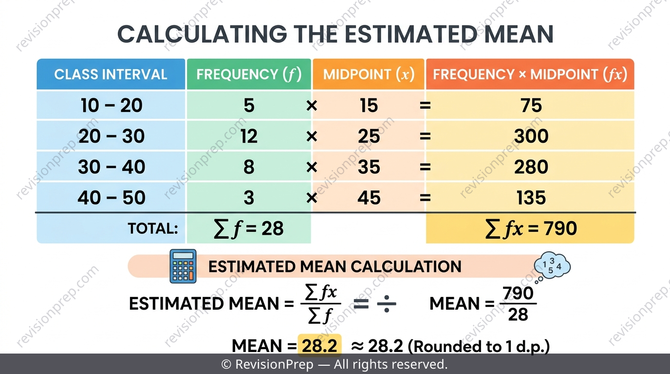
Because grouped data replaces every value in an interval with its midpoint, any mean calculated from a grouped table is only ever an estimate of the true mean. The method is to multiply each midpoint by its frequency, sum those products, then divide by the total frequency. Always write the midpoint calculation as its own line before multiplying, so the method mark is locked in even if a later arithmetic slip happens.
Exam tip
If a question asks you to comment on whether the estimated total equals the real total, say explicitly that it's an estimate — because every value in an interval was treated as if it equalled the midpoint.
Common mistake
Multiplying frequency by the lower bound (or upper bound) of an interval instead of the midpoint — this single slip throws off the whole calculation.
Mini summary
Estimated mean = Σ(frequency × midpoint) ÷ Σfrequency — never exact once data is grouped.
Working Backwards: Finding a Missing Value from the Mean
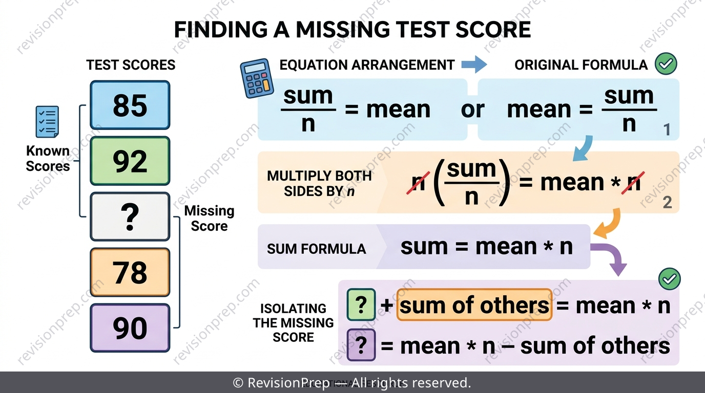
Since mean = sum ÷ n, rearranging gives sum = mean × n — and this lets you solve for a missing score if you already know the mean and every other value. Always state n first by counting the TOTAL number of values (including the unknown one), then subtract the sum of the known values from the required total sum. The exact same logic applies to a missing frequency in a grouped table.
Exam tip
Write 'n = ...' as your very first line of working, counted directly from the question, before touching any other numbers.
Common mistake
Multiplying the mean by the number of KNOWN values instead of the TOTAL number of values including the missing one — this is the single most common slip in this type of question.
Mini summary
Rearrange mean = sum ÷ n into sum = mean × n, then subtract the known sum from the total required sum.
Box Plots and Interquartile Range
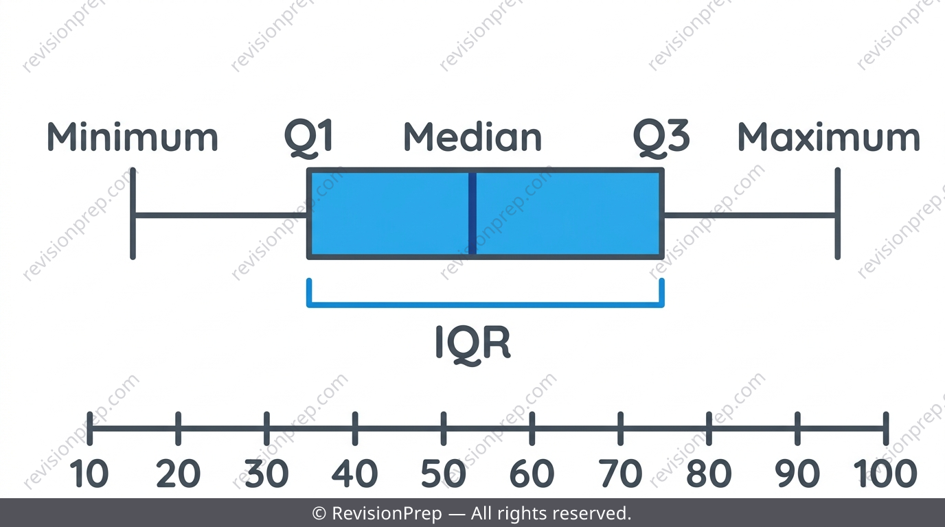
A box plot compresses a whole ordered data set into five landmark numbers: minimum, lower quartile (Q1), median, upper quartile (Q3), and maximum. Data must always be sorted first, since every quartile is defined by position. Q1 is the median of the lower half and Q3 is the median of the upper half — for an odd number of values, exclude the overall median from both halves before splitting.
| Statistic | What it shows |
|---|---|
| Median | Splits the ordered data exactly in half |
| Box (Q1 to Q3) | The middle 50% of the data — width shows spread |
| Whiskers | Range of the outer 25% on each side |
| IQR = Q3 − Q1 | Spread of the middle 50%, ignoring extreme outliers |
Common mistake
Including the overall median inside the lower or upper half when finding Q1 or Q3 — for odd n, this shifts both quartiles and gives the wrong IQR.
Mini summary
Sort first, split around the median, then IQR = Q3 − Q1 describes the spread of the middle half.
Spotting Misleading Statistics
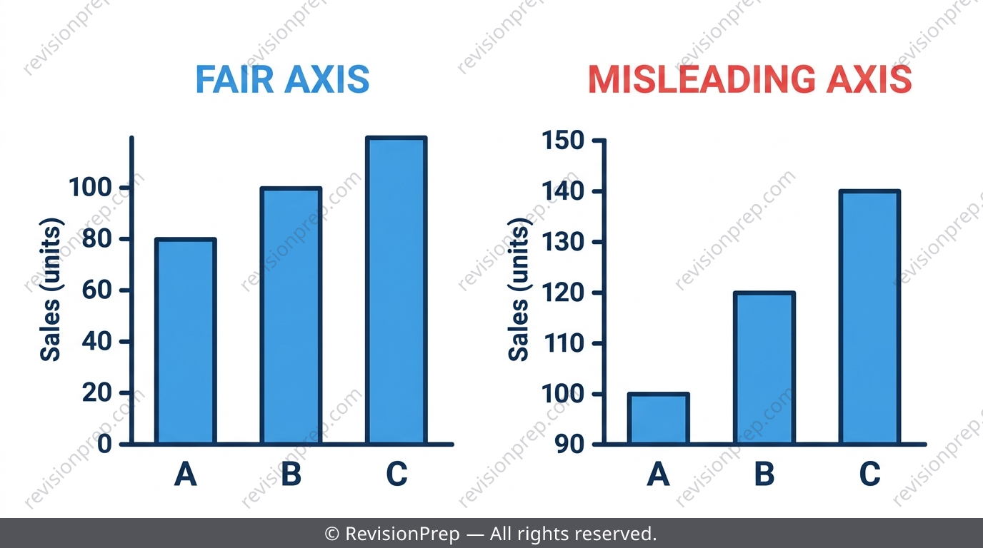
Every grouping decision, choice of average, and axis scale is a decision that can hide as much as it reveals. Cramming 200 students aged 6–18 into one giant interval erases all sense of whether the group is mostly children or teenagers. The mean is dragged by extreme values while the median resists this, so reporting 'the average' without saying which one can mislead — and a bar chart with a truncated, non-zero axis can make a tiny difference look huge.
Exam tip
When comparing two data sets, always quote a measure of centre (mean or median) AND a measure of spread (range or IQR) in the same sentence — one number alone is never a fair comparison.
Common mistake
Reporting small sample results as if representative, e.g. '3 out of 4 students prefer...', without acknowledging how few people were actually surveyed.
Mini summary
Question which average is used, whether intervals hide the shape, and whether axes are drawn fairly.
Quick formula sheet
Practice questions
- Find the midpoint of the class interval 20–30.
- The mean of four numbers is 8. What is the sum of the four numbers?
- Order the data set 5, 9, 3, 7, 1 and state the median.
- A grouped table has intervals 0–10 (f=3), 10–20 (f=5), 20–30 (f=2). Estimate the mean.
- The mean of six scores is 12. Five of the scores are 8, 10, 14, 15 and 11. Find the sixth score.
- For the data set 4, 8, 9, 12, 15, 18, 21, find Q1, Q3 and the IQR.
- Explain why grouping 200 ages into a single 6–18 interval hides important information, and propose better class intervals with a justification.
- A grouped frequency table has a missing frequency in one interval. Given the overall mean, set up and solve an equation to find it.
- Two classes have the same median test score but very different IQRs. Explain what this tells you about each class's performance, using both centre and spread.
Frequently asked questions
Why is the mean from grouped data called an 'estimate'?+
Because grouping replaces every individual value inside an interval with its midpoint, so the exact original numbers are lost and any mean calculated afterwards is only an approximation of the true mean.
How do I find a missing value if I only know the mean?+
Rearrange mean = sum ÷ n into sum = mean × n, count the total number of values including the missing one, then subtract the sum of the known values from that total.
What's the difference between range and interquartile range?+
Range uses the maximum and minimum, so it's affected by extreme outliers. IQR only uses Q1 and Q3, so it describes the spread of the middle 50% and ignores extreme values.
Do I need to sort data before finding quartiles?+
Yes — quartiles are defined by position in an ordered list, so unsorted data gives meaningless quartile values.
Why must class widths stay the same across a grouped table?+
Equal class widths keep histogram bars fairly comparable; unequal widths distort the shape and can mislead anyone reading the chart.
How can averages be used to mislead people?+
The mean can be pulled by extreme values while the median stays stable, so quoting 'the average' without saying which type was used can accidentally or deliberately misrepresent the data.
Get the Full MYP 3 Statistics Revision Notes
Related articles