
Data Handling and Representation
Turn messy raw data into tally charts, frequency tables and the right graph — every time.
Quick facts
Data handling is one of the most predictable topics in IB MYP 1 Mathematics — and one of the easiest to lose marks on through process errors rather than difficult maths. Every question either asks you to turn raw data into a tally chart and frequency table, or asks you to read, choose or draw the right graph: bar chart, line graph, pie chart, stem-and-leaf diagram or dot plot. The arithmetic behind each of these is simple, but examiners consistently catch students out on miscounted tallies, missing totals, one-word answers to 'describe' questions, and pie chart angles that don't add up to 360°. This teaser walks through the five ideas that show up again and again in MYP 1 assessments, with the formulas, common traps and exam-style habits you need. For full worked examples and the complete mistake bank, the linked revision notes go much deeper.
What you’ll be able to do
Raw Data, Tally Charts and Frequency Tables
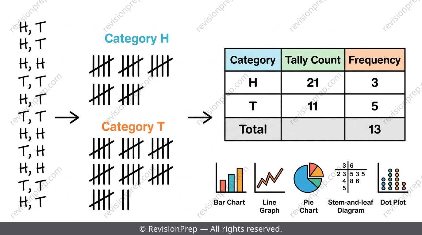
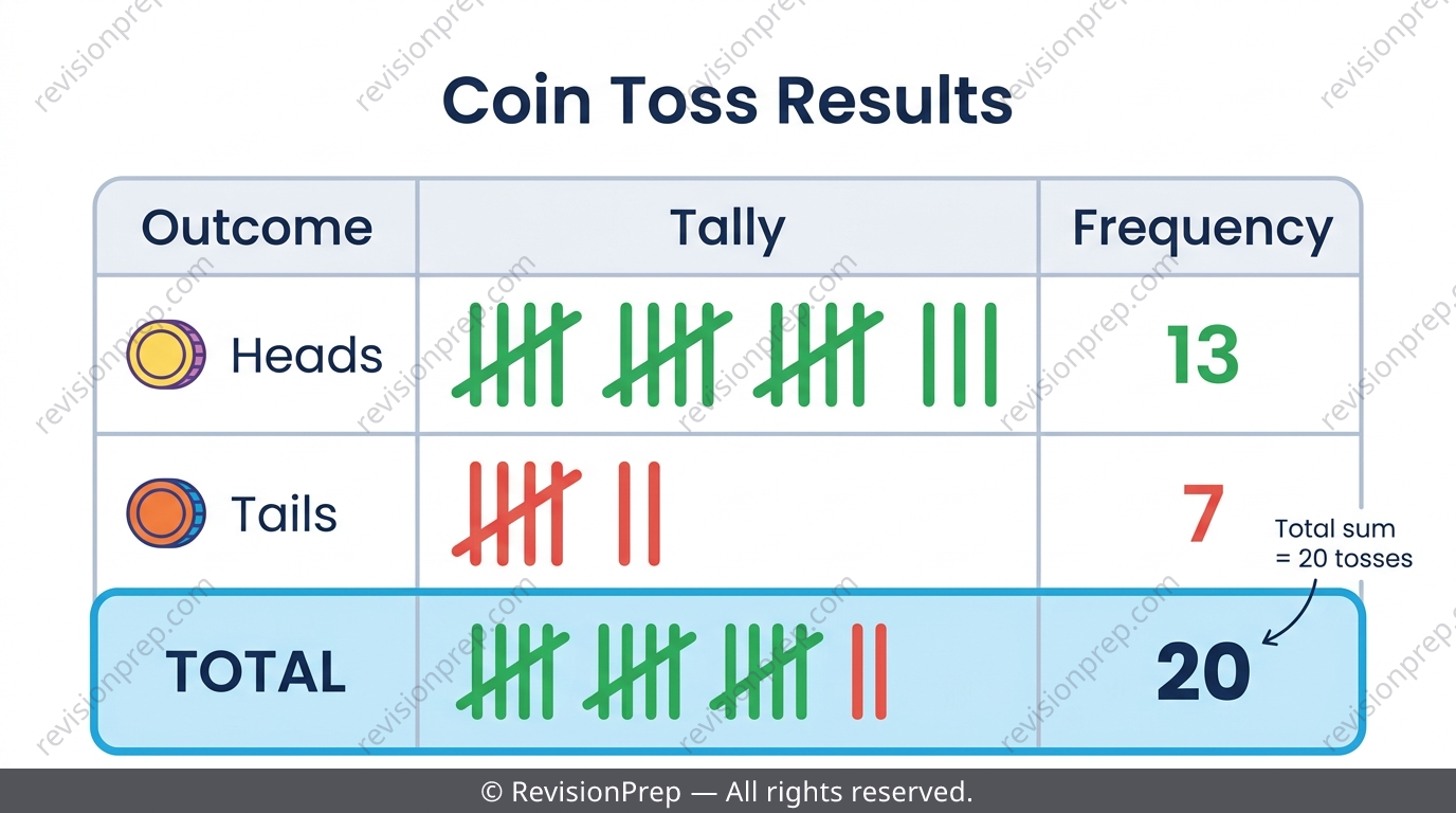
Raw data is the original messy list — nobody can spot a pattern in it directly. A tally chart is the working-out step: go through the list once, making a mark for every occurrence, bundled in fives so long lists don't lose you. The frequency table is the finished product — one clean number per category, with a total row that must match the number of raw data items you started with.
| Term | What it is |
|---|---|
| Raw data | The original unsorted list of responses or measurements |
| Tally mark | A stroke per occurrence, bundled in fives |
| Frequency | The final count written down, not the tally itself |
Exam tip
'Identify' questions need a one-word answer; 'describe' questions need a full sentence — mixing these up is the single most common way this topic loses easy marks.
Common mistake
Crossing a tally bundle incorrectly (a diagonal after only three strokes) or losing count partway through a long list and guessing the rest.
Mini summary
Tally is the counting process; frequency is the answer — always check .
Grouped Frequency Tables for Numerical Data
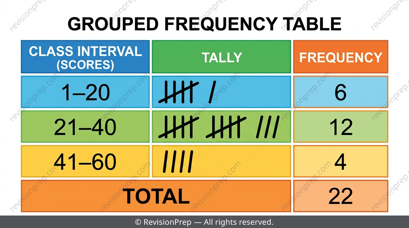
When numerical data spans a wide range — like test scores from 8 to 59 — listing every single value would make a huge, unreadable table. Instead, values are grouped into class intervals such as , and . This keeps the table manageable, but the trade-off is real: once values are grouped, you can no longer see the exact original numbers.
Exam tip
If a 'describe' question asks what the frequency column shows, answer in a full sentence, e.g. 'the frequency column shows how many scores fall into each interval' — not just the word 'amount'.
Common mistake
Dropping an awkward single-digit value (like 8) because it doesn't seem to fit — every value from the raw list must be placed somewhere.
Mini summary
Grouping trades exact values for a readable table — know that trade-off exists.
Choosing the Right Graph: Bar, Line or Pie
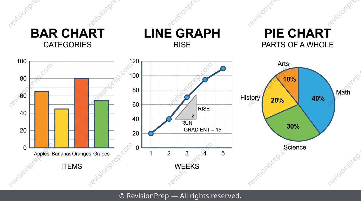
Once the frequency table exists, the graph choice depends on what the data is answering. Comparing separate categories against each other calls for a bar chart, with equal gaps between bars to show the categories are distinct. Watching something change over an ordered sequence like time calls for a line graph, where the steepness of the line shows the rate of change. Showing how a total splits into shares calls for a pie chart, where each slice's angle is proportional to its share of the total.
| Graph | Best for | Key feature |
|---|---|---|
| Bar chart | Comparing separate categories | Equal gaps between bars |
| Line graph | Change over time / continuous sequence | Gradient = rate of change |
| Pie chart | Proportion of a whole | Angle proportional to share |
Common mistake
Drawing a bar chart with bars touching, with no gaps — gaps are essential to show the categories are separate.
Mini summary
Match the graph to the question: compare = bar, change = line, proportion = pie.
Pie Chart Angles and Line Graph Gradients
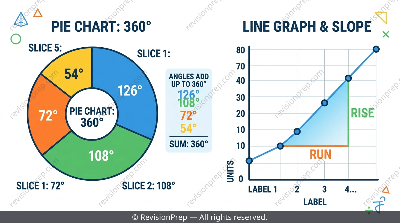
A pie chart's sector angle is found with , where is the category's frequency and is the total. Because a full circle is , every set of sector angles must add up to — this is your automatic error check. A line graph's steepness over any section is its gradient, , and this tells you the rate of change, not just the size of the change.
Exam tip
Never judge the steepest section of a line graph by eye — calculate for each candidate interval before comparing, especially if the time intervals aren't equal.
Common mistake
Rounding each pie chart angle separately before checking the total — this can make the angles fail to add up to .
Mini summary
Angles must sum to ; gradient — not the raw rise — measures rate of change.
Stem-and-Leaf Diagrams and Dot Plots
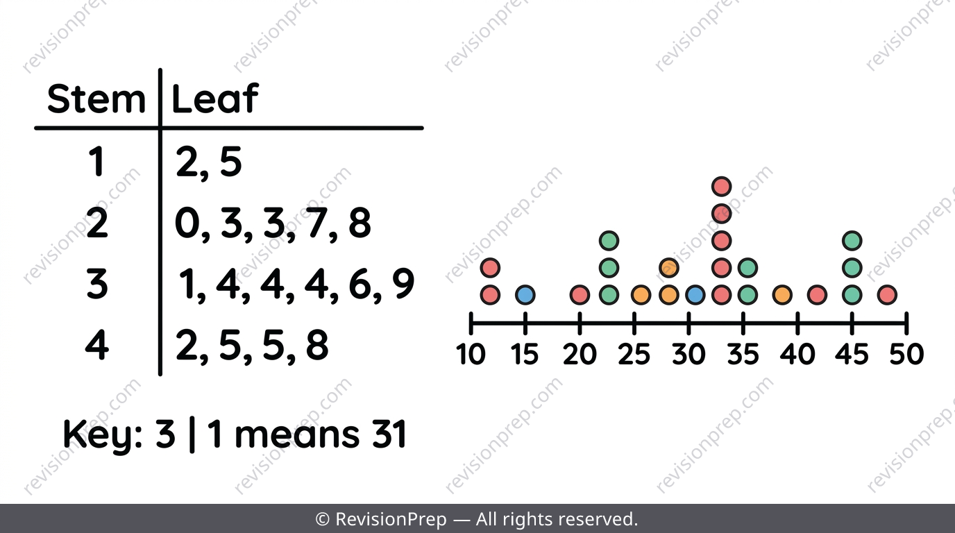
A stem-and-leaf diagram splits each numerical value into a stem (the leading digit) and a leaf (the remaining digit), so you can see both the overall shape of the data AND every individual value at once. Leaves must be written in increasing order next to each stem, and a key like 'Key: 3 | 1 means 31' is compulsory — without it the diagram is ambiguous and can't be marked. Dot plots are simplest for small sets of discrete data: each value gets a dot, and repeats stack directly on top of each other.
Common mistake
Drawing a perfectly ordered stem-and-leaf diagram but leaving out the key, or writing an incomplete key like just '3 | 1'.
Mini summary
Stem-and-leaf keeps every value visible while still showing shape — but only with a full key.
Quick formula sheet
Practice questions
- A survey records 12 votes: Red, Blue, Red, Green, Blue, Blue, Red, Green, Blue, Red, Green, Blue. Draw a tally chart and frequency table for the colours.
- State whether shoe size (3, 4, 5, 6...) and eye colour (blue, brown, green) are categorical or numerical data.
- Why must the total of a frequency column equal the number of raw data items given in a question?
- A class of 20 students has test scores ranging from 11 to 58. Explain why a grouped frequency table with class intervals would be more useful than listing every score.
- A survey of 40 people shows: Bus 16, Car 10, Walk 8, Bike 6. Calculate the pie chart angle for each transport method.
- Explain when you would choose a bar chart over a line graph for a set of data, giving one reason.
- A line graph records temperature at (0,5), (2,9), (3,15), (5,17) in hours and °C. Calculate the gradient of each section and identify which interval has the fastest rate of change.
- Construct a stem-and-leaf diagram for these ages: 21, 34, 19, 45, 27, 38, 41, 23, and write a correct key.
- A pie chart has four sectors calculated as 92°, 118°, 74° and 77°. Explain why this set of angles must be checked, and what error might have caused it if the total isn't 360°.
Frequently asked questions
What is the difference between a tally and a frequency?+
A tally is the working mark you make while counting through raw data, bundled in fives. Frequency is the final number you write down once the tallying is finished — it's the answer, not the working.
How do you calculate the angle of a pie chart sector?+
Use , where is the frequency of that category and is the total frequency. Always check all your angles add up to .
When should I use a grouped frequency table instead of a normal one?+
Use a grouped frequency table when numerical data spans a wide range, like test scores from 8 to 59. Grouping into class intervals keeps the table readable, though you lose sight of the exact original values.
Why does a stem-and-leaf diagram need a key?+
Without a key, a reader can't tell what a stem-leaf pair like '3 | 1' means — it could be 31, 3.1, or something else. A full key such as 'Key: 3 | 1 means 31' is compulsory and often assessed directly.
When do I use a bar chart instead of a line graph?+
Use a bar chart to compare separate categories (with gaps between bars). Use a line graph when tracking how something changes over an ordered sequence like time, where the gradient shows the rate of change.
What's the most common way marks are lost in this topic?+
Process errors, not maths errors: miscounted tally bundles, forgetting to check the frequency total, missing stem-and-leaf keys, and giving one-word answers to 'describe' questions.
Get the Full IB MYP 1 Data Handling Revision Notes
Related articles