
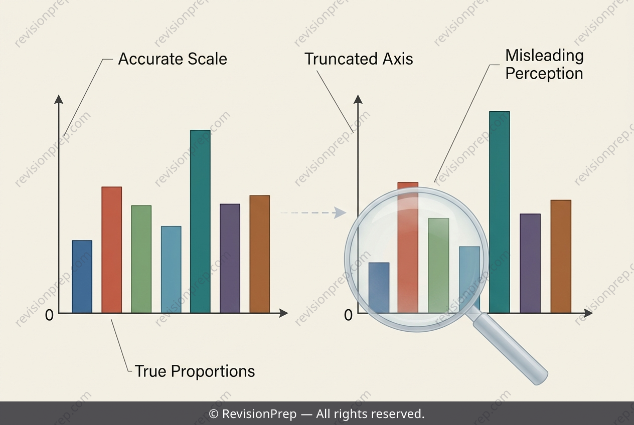
Maths: Bar Charts - A Shifted Axis Exaggerates Data
Every graph tells a story, and how you draw it shapes what that story seems to say. This topic explores ethical data visualization, focusing on how the design choices behind a simple bar chart can quietly distort the truth. The central rule is straightforward: the vertical axis of a bar graph must begin at zero. This matters because bars encode value through their length, so the baseline anchors every comparison a viewer makes. When that baseline shifts, the relationship between the data and what we perceive breaks down. Starting the axis above zero exaggerates the differences between bars, making values look further apart than they truly are and giving a false picture of the data. Understanding this connection between axis scale and visual comparison is what separates an honest graph from a misleading one, and it is a skill that applies far beyond the mathematics classroom.
Start practising IB questions today
150,000+ IB-styled questions, criteria-mapped and instantly accessible.