
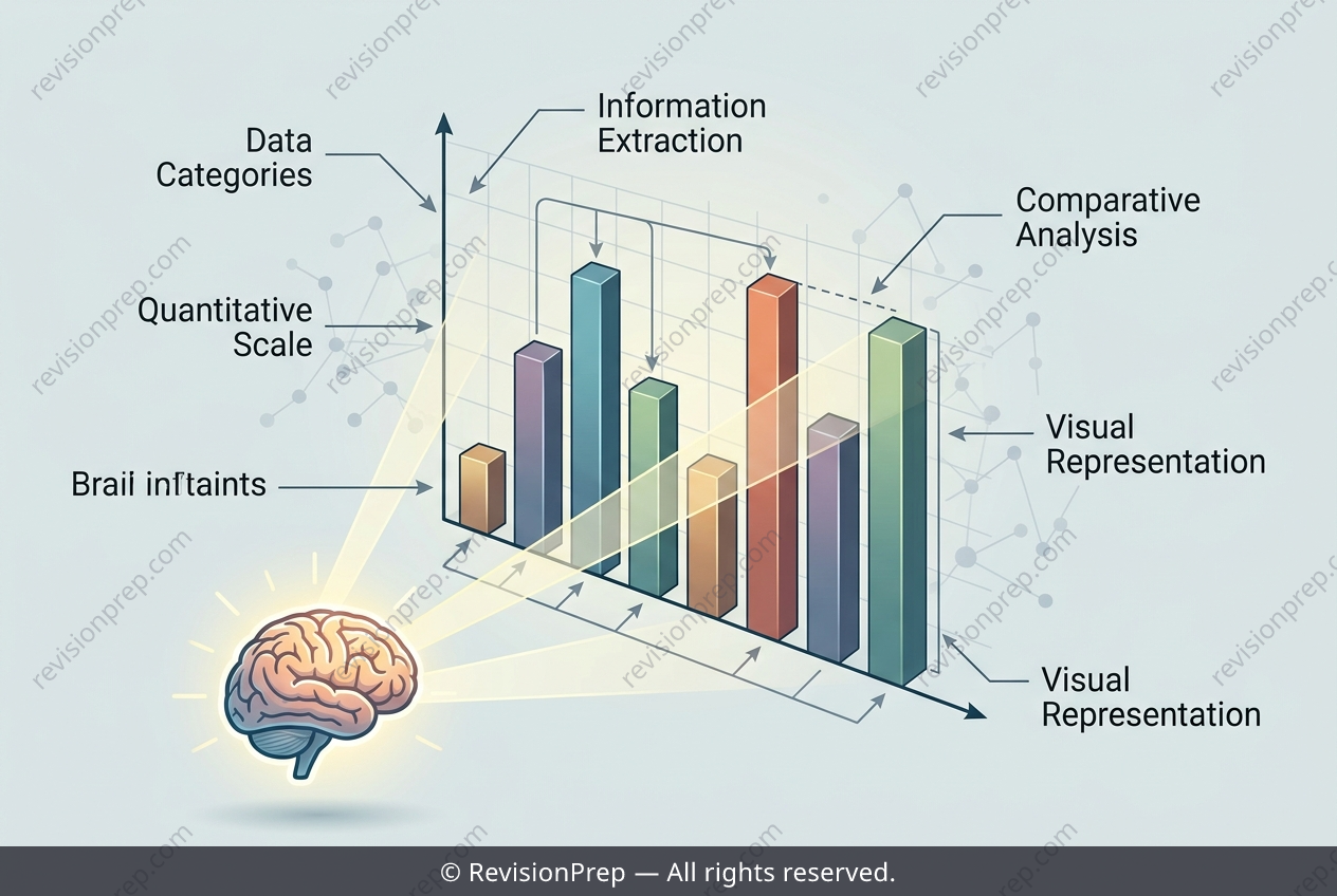
Maths: Decoding Frequency and Ratio in Bar Charts
Reading data from a chart is one of the most practical skills in mathematics. A bar chart turns raw counts into a picture, where each bar's height represents the frequency — the number of people or items in that category. Taller bars mean larger counts, so the tallest bar immediately reveals the most popular option, while the shortest shows the least chosen. This matters because comparing quantities visually is faster than scanning a table of numbers, yet the two must always agree. The relationship between bars is just as informative as the bars themselves: if one category has 12 and another has 4, the first is 3 times the second, a ratio of 12 : 4 that simplifies to 3 : 1. Spotting these connections — frequency, comparison, and ratio — is what transforms a simple chart into genuine data interpretation.
Start practising IB questions today
150,000+ IB-styled questions, criteria-mapped and instantly accessible.