
Maths: How Dot Plots Show Consistency and Variation
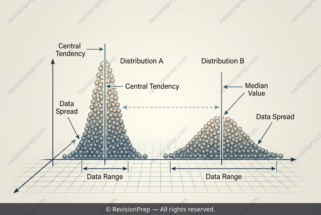
Comparing data distributions is a fundamental skill in statistics, and dot plots offer one of the clearest ways to see how two datasets differ. This topic explores how to analyse two sets of test scores side by side, using measures of central tendency and spread to build a complete picture of each group's performance. The median identifies the middle value once scores are ordered, giving a typical score that resists distortion by extreme results. The range, calculated as the highest value minus the lowest, captures how widely scores are dispersed. Together, these measures reveal both where a class performs and how variable that performance is. Consistency emerges from combining these ideas: a smaller range with scores clustered closely together signals more reliable, uniform performance, while a larger range with values scattered across a wider interval indicates greater variability. Reading dot plots carefully — noting clusters, gaps, and outliers — allows meaningful comparisons between groups rather than relying on averages alone.
Start practising IB questions today
150,000+ IB-styled questions, criteria-mapped and instantly accessible.