
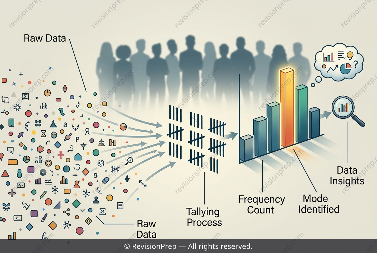
Maths: How Frequency Tables Reveal the Mode
Frequency tables and tally charts turn raw observations into a clear picture of how data is distributed. Each row pairs a category — here, a fruit — with its frequency, the count of how many times it appears. This simple structure makes patterns visible at a glance, letting you compare categories and spot which value occurs most often. That most frequent value is the mode, the measure of central tendency that identifies the most common outcome in a data set. Unlike the mean or median, the mode works for categorical data, where averaging makes no sense. Reading a frequency table, the mode is simply the category with the highest frequency. Its value lies in interpretation: the mode tells you what is most typical or popular within a group, connecting a single number to a real preference shared by the students surveyed.
Start practising IB questions today
150,000+ IB-styled questions, criteria-mapped and instantly accessible.